

Problem Statement: Learning Is Hard When Life Gets Busy
Learning shouldn’t feel like a chore—but for many people, it does.
Students and professionals alike want to keep growing, but their days are filled with meetings, errands, and screen fatigue. They squeeze in what they can—between commutes, workouts, or chores—but long videos, unengaging interfaces, and scattered platforms make learning inconvenient.
Through interviews and surveys, I uncovered key trends:
Users often lose interest in long or overly academic lessons.
Audio is the preferred format during multitasking.
Many want short, digestible content but can’t find apps that adapt to their learning habits.
Navigation overload, small text, and irrelevant content lower motivation.
Offline access and a clean experience are non-negotiables.
This wasn’t just anecdotal. The market reflected the problem:
Audio learning apps were trending, but few offered personalization.
EdTech competitors emphasized breadth, not relevance or speed.
Users were craving a way to learn smarter, not harder.
Solution Overview: A Learning App for Real Life
To solve this, I designed a mobile-first learning app that fits seamlessly into everyday routines. It supports:
My Role
I led the end-to-end UX design process, including user research, synthesis, prototyping, testing, and UI design. I also conducted competitor analysis, created personas, and developed the design system.
My Design Process
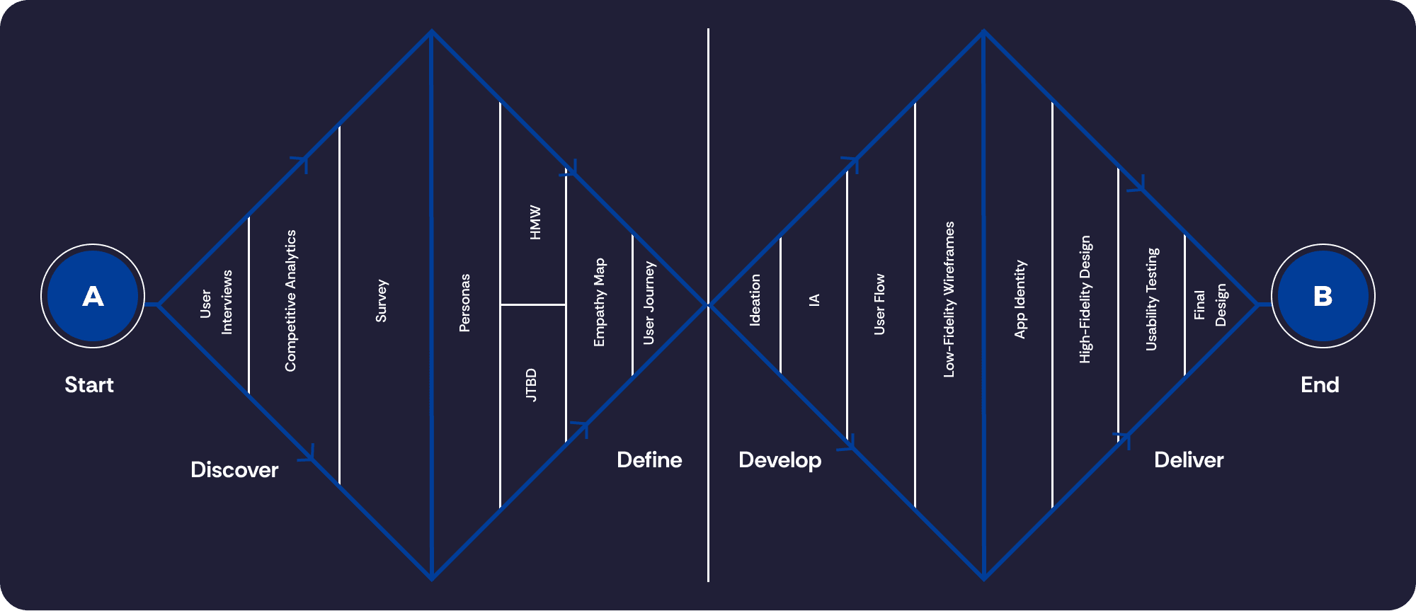
To guide my design approach, I followed the Double Diamond Process. It consists of four phases:
1- Discover – I began by exploring the problem space through user interviews, surveys, and competitive analysis. This helped uncover real user needs, behaviors, and pain points.
2- Define – I synthesized findings into key themes using affinity mapping and created personas to clarify the core problem. This narrowed focus to the most impactful design opportunities.
3- Develop – I ideated solutions through ideations, sketched early concepts, and iterated on wireframes. The design evolved through feedback and testing.
4- Deliver – I finalized high-fidelity designs, created a design system, and validated usability. Iterations were guided by real user insights to ensure relevance and impact.
Competitive Analysis
I examined 7 popular learning apps (like Blinkist, Headway, and Majrah) to assess how they deliver short-form learning.
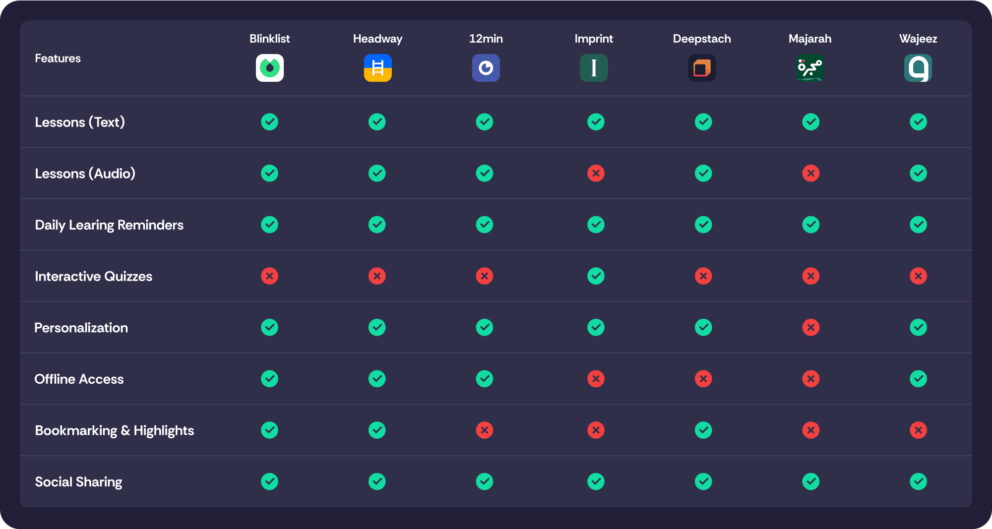
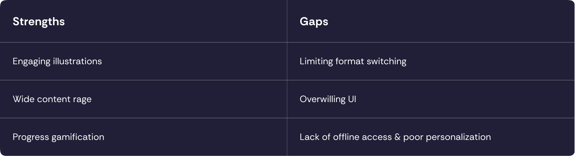
These gaps validated an opportunity: design a lightweight, adaptable app with strong usability and real-world flexibility.
User Research
I interviewed 5 users and gathered 70+ survey responses.
Key themes:
They want flexibility: learn while driving, cooking, or walking.
They favor short lessons (under 10 minutes).
Retention increases when they control the pace and format.
Existing apps were “too much”—cluttered, ad-heavy, or slow.
Accessibility matters: small fonts and long blocks reduce engagement.
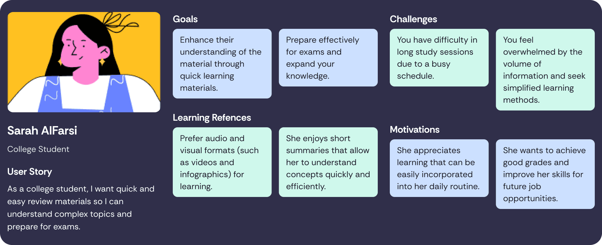
Persona
Sarah AlFarsi — The Efficient College Learner: A busy college student who values quick, engaging learning materials to help her understand complex topics and prepare for exams. She prefers audio and visual formats like videos and infographics, and enjoys bite-sized summaries that fit into her daily routine.
Motivated by academic success and future job readiness, Sarah struggles with long study sessions and feeling overwhelmed by too much information.
Ahmed AlNassir — The On-the-Go Professional: A marketing manager juggling work and family life, Ahmed seeks practical, up-to-date content that keeps him competitive without taking away from his personal time. He favors audio formats like podcasts that allow him to learn while multitasking.
His main challenges are limited time and guilt over personal development cutting into family time, but he’s driven to grow professionally and provide for his loved ones.

Affinity Map
Learners—both students and professionals—struggle to fit study time into busy lives. They feel overwhelmed by too much information and limited time, often juggling work, school, and family. They prefer short, accessible content—especially in audio or visual formats—and want practical insights they can apply quickly. While motivated, they often feel guilt or frustration, highlighting a strong need for flexible, efficient learning solutions.

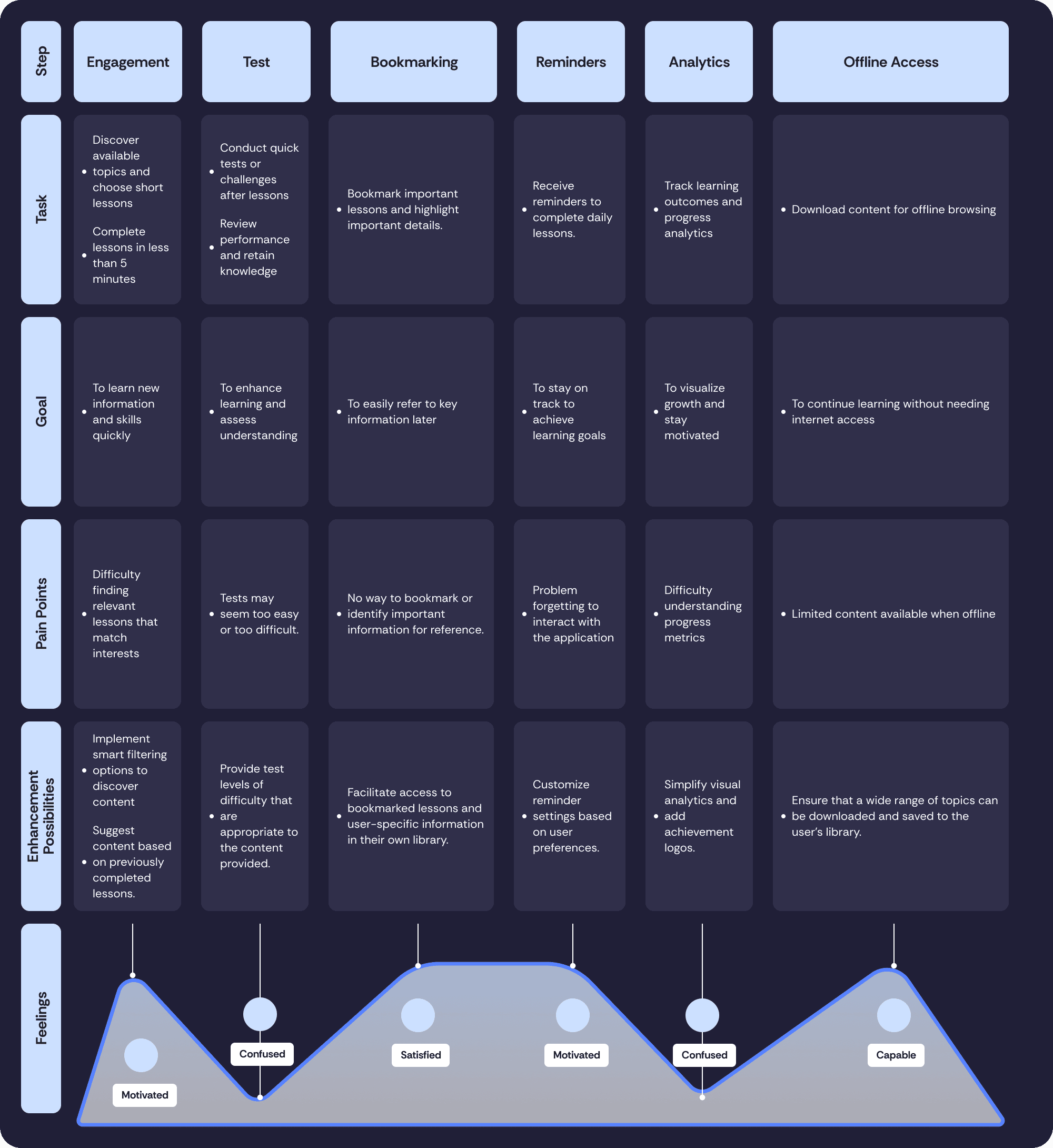
User Journey Map
Illustrated emotional highs and lows across key interactions and helped spot design opportunities.
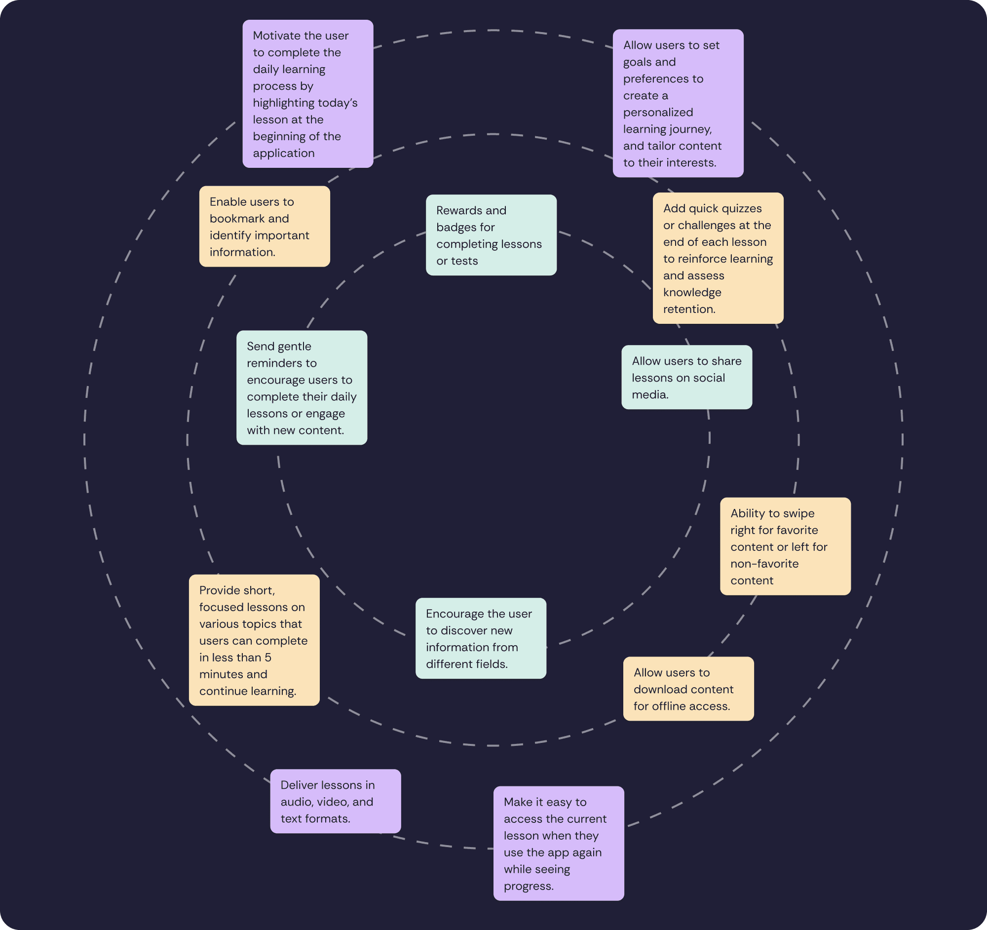
Ideation: Turning Problems Into Opportunities
Using ideation, I generated design opportunities:
how to let users switch learning formats effortlessly?
how to personalize content without extra setup?
how to reduce friction and cognitive load during learning?
how to help users learn even without internet?
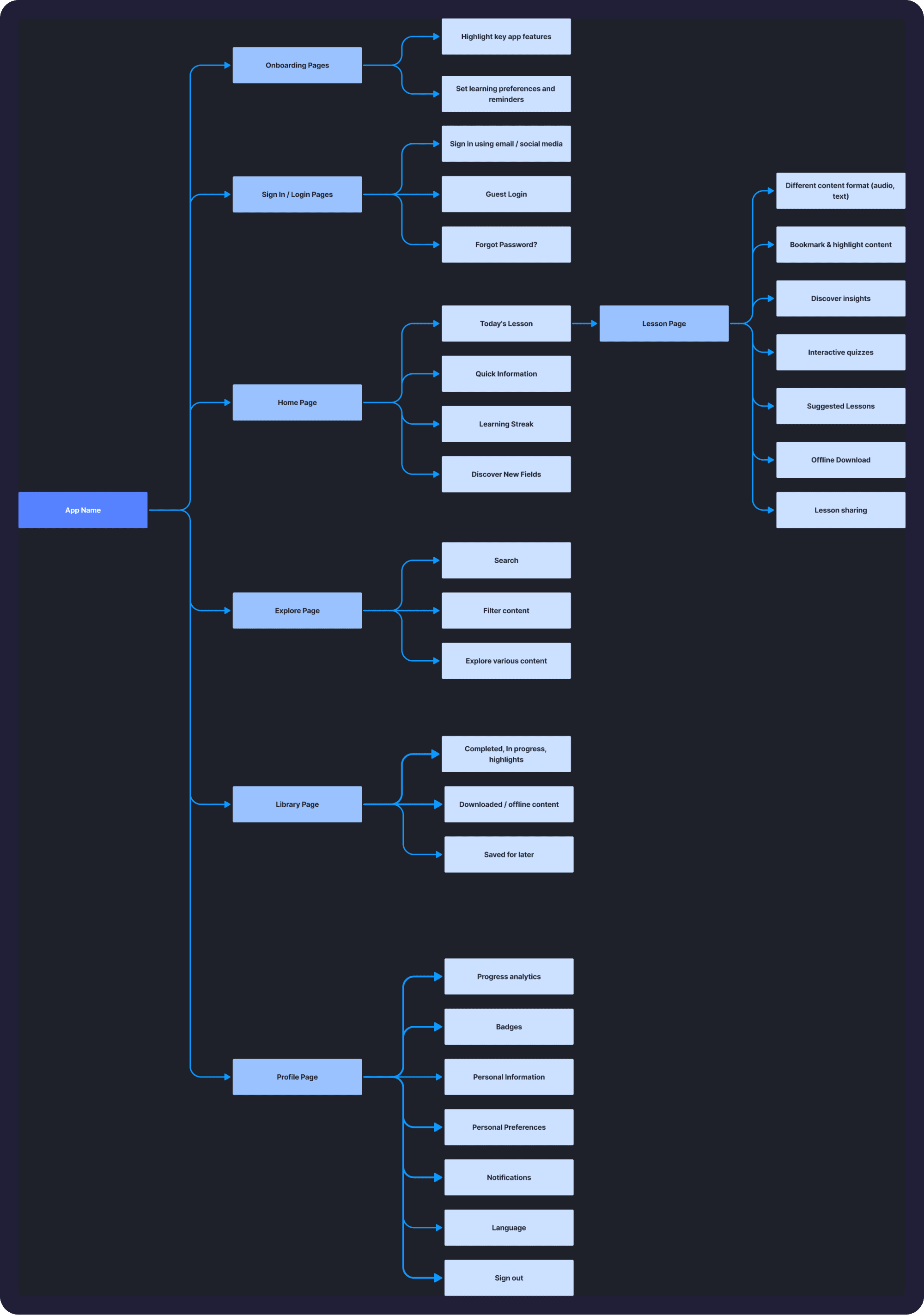
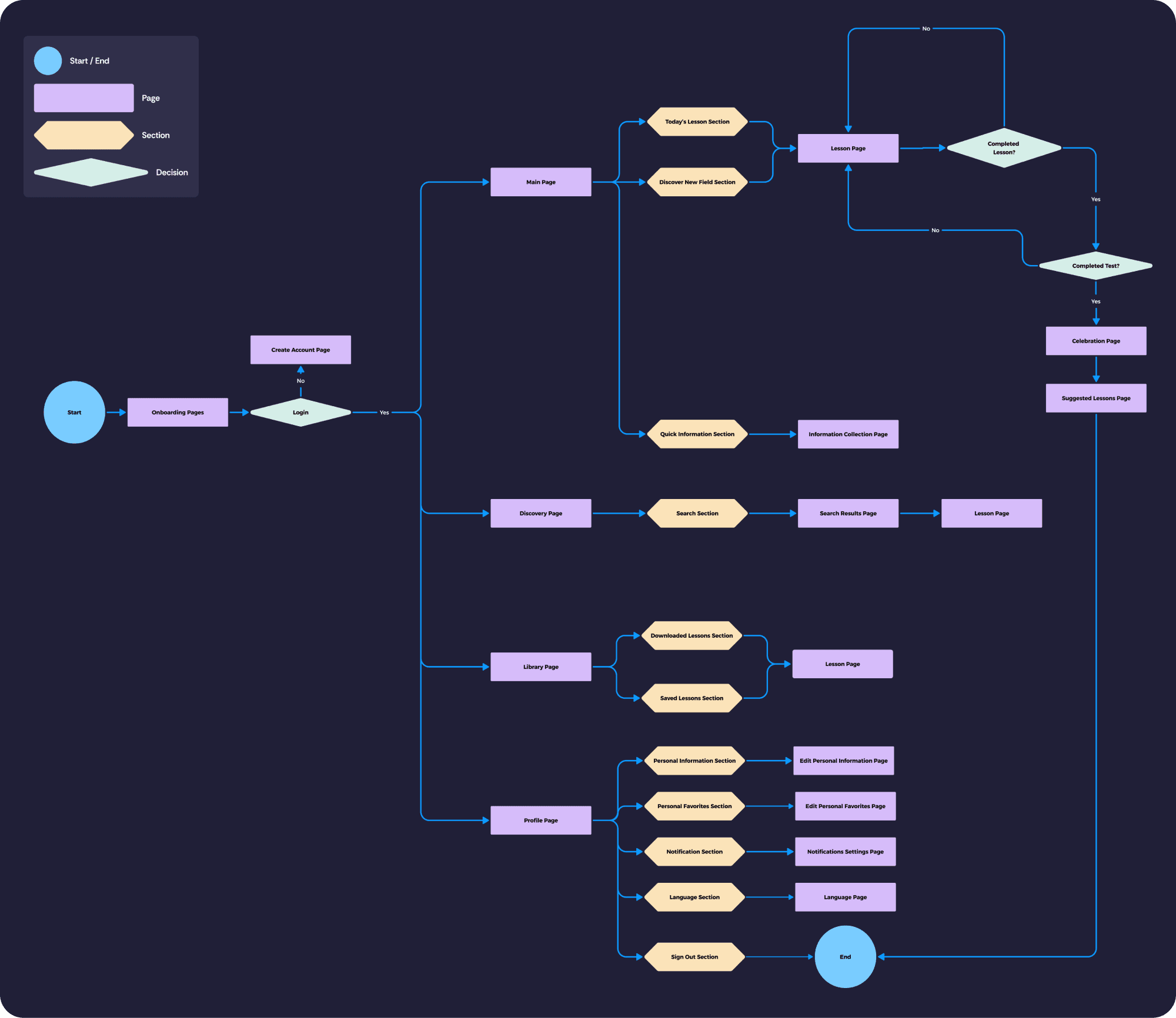
Information Architecture & User Flow
With key features defined, I mapped the IA and user flow to simplify access:
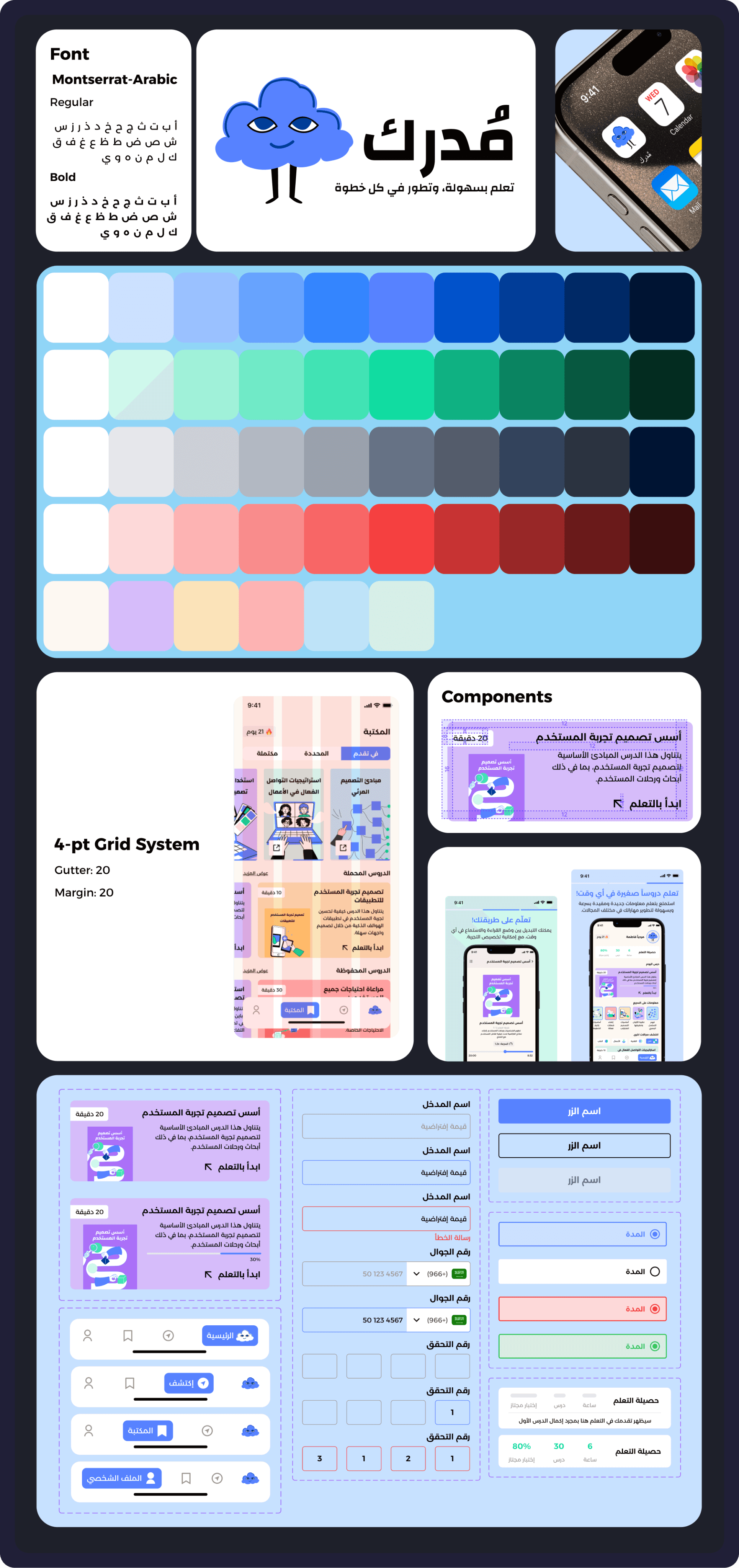
Design System: Visual Identity & Accessibility
I created a cohesive design system with:
A calming palette and accessible contrast levels
Readable typography using a 4pt grid
Logo and icons aligned with a minimal, modern aesthetic
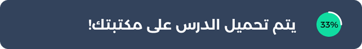
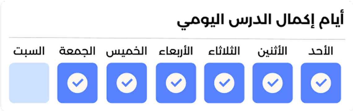
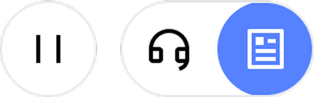
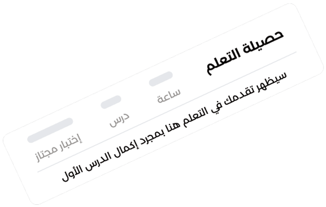
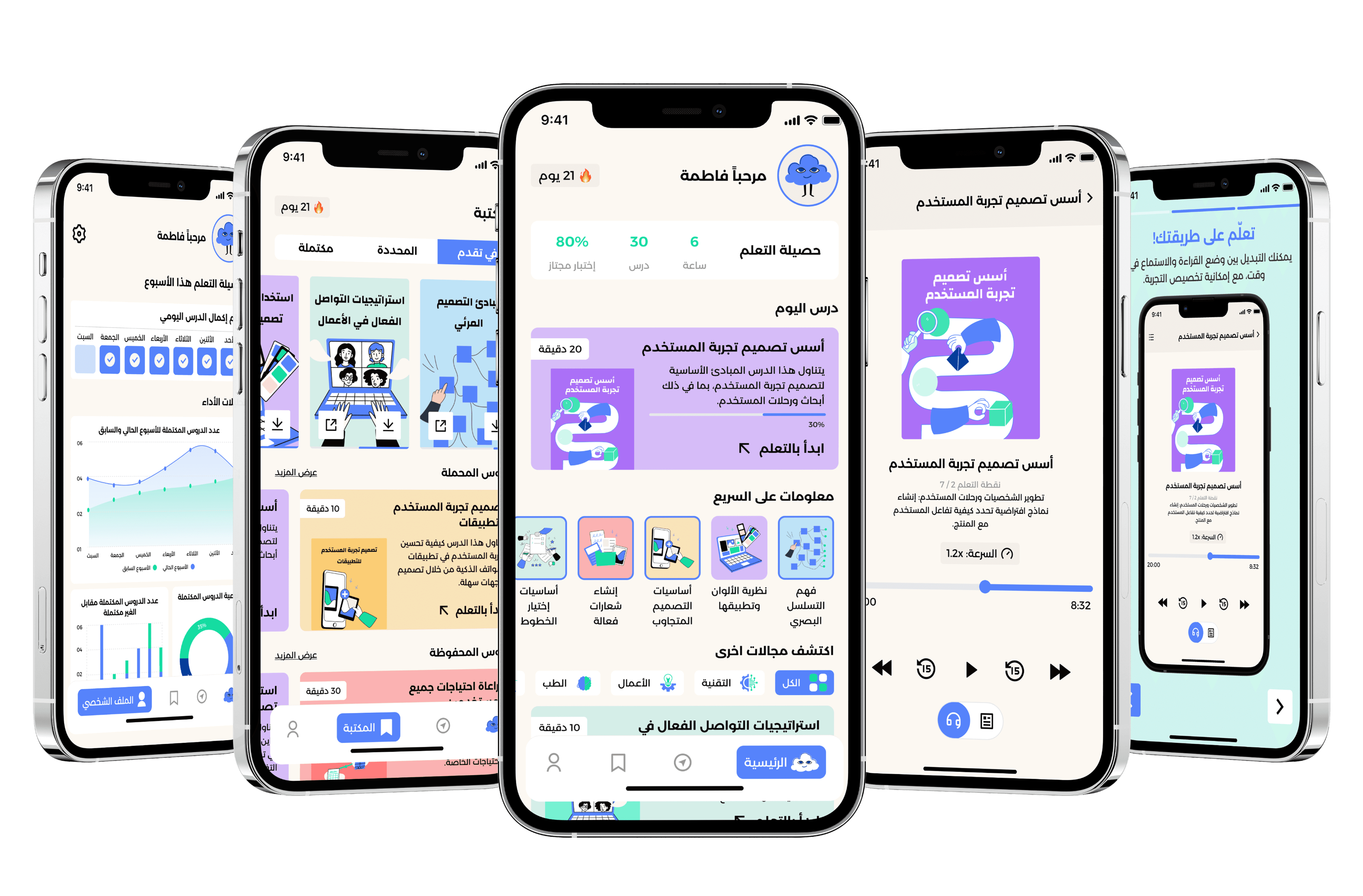
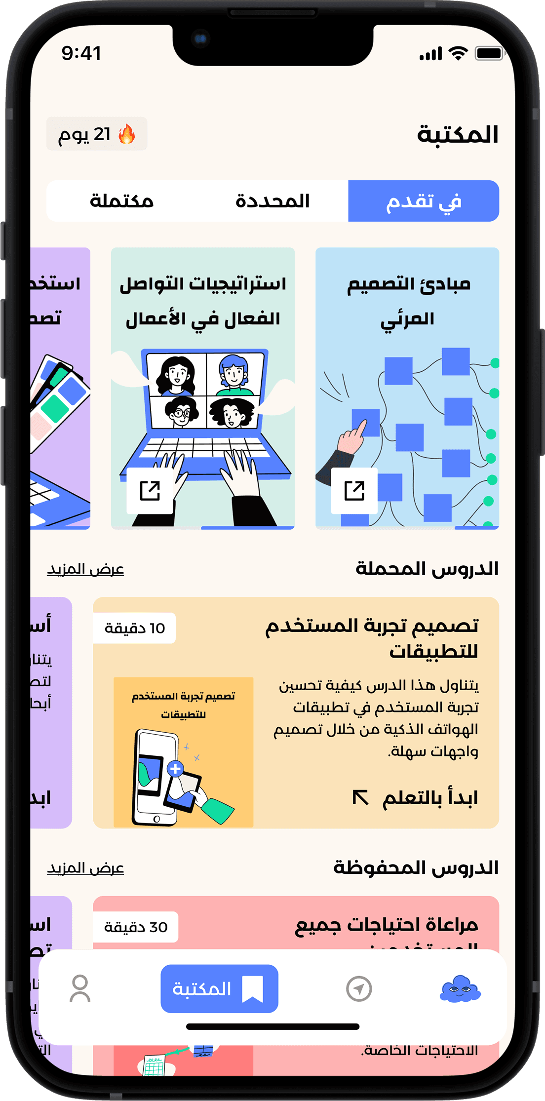
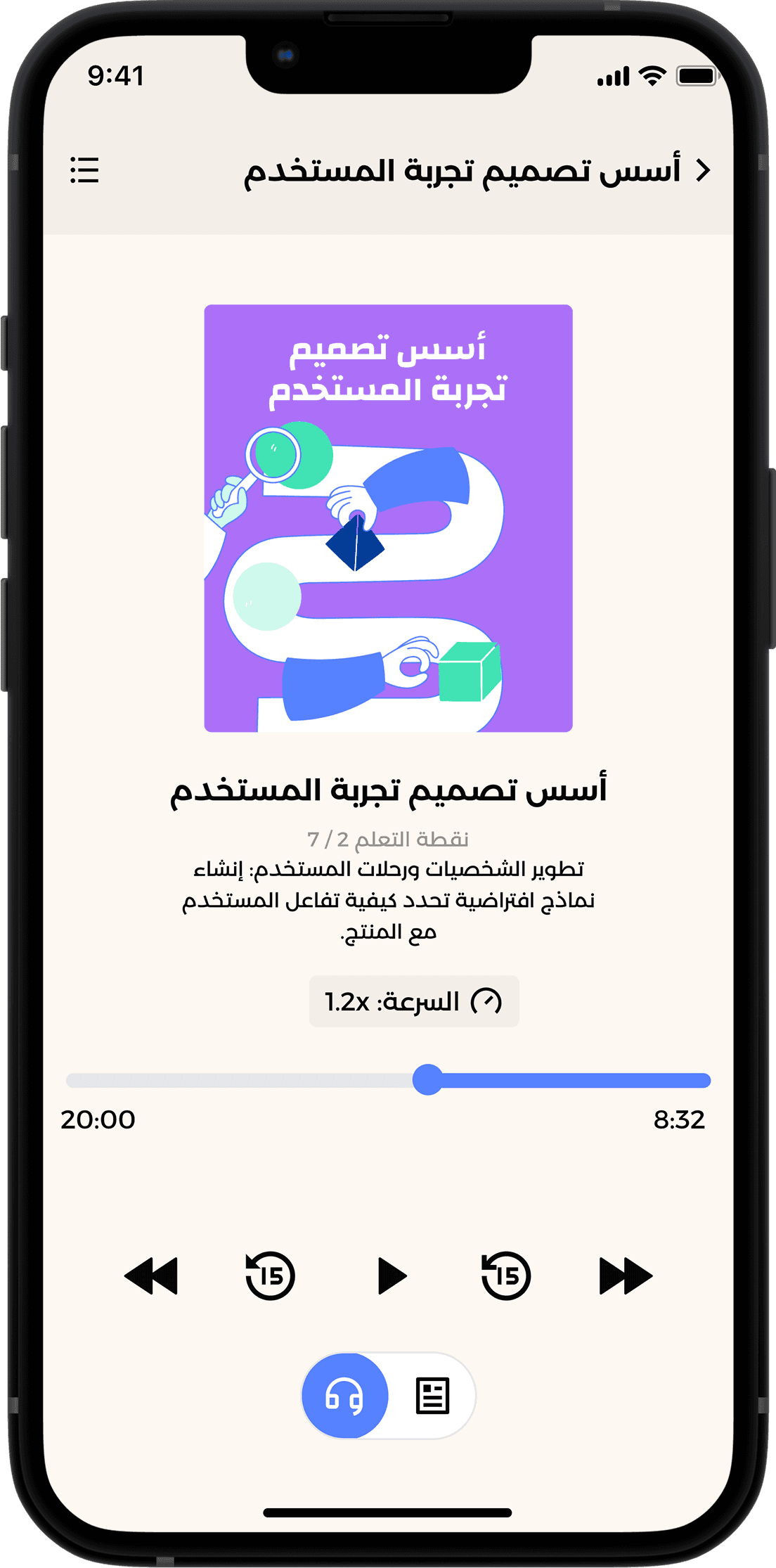
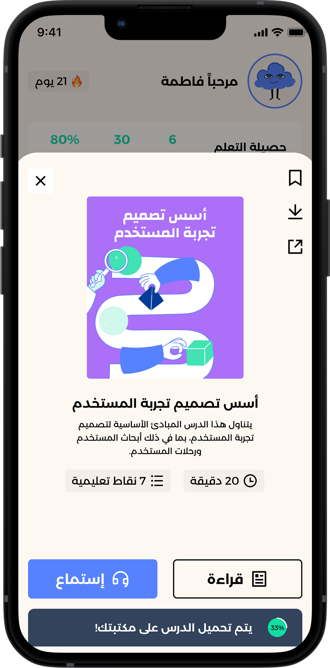
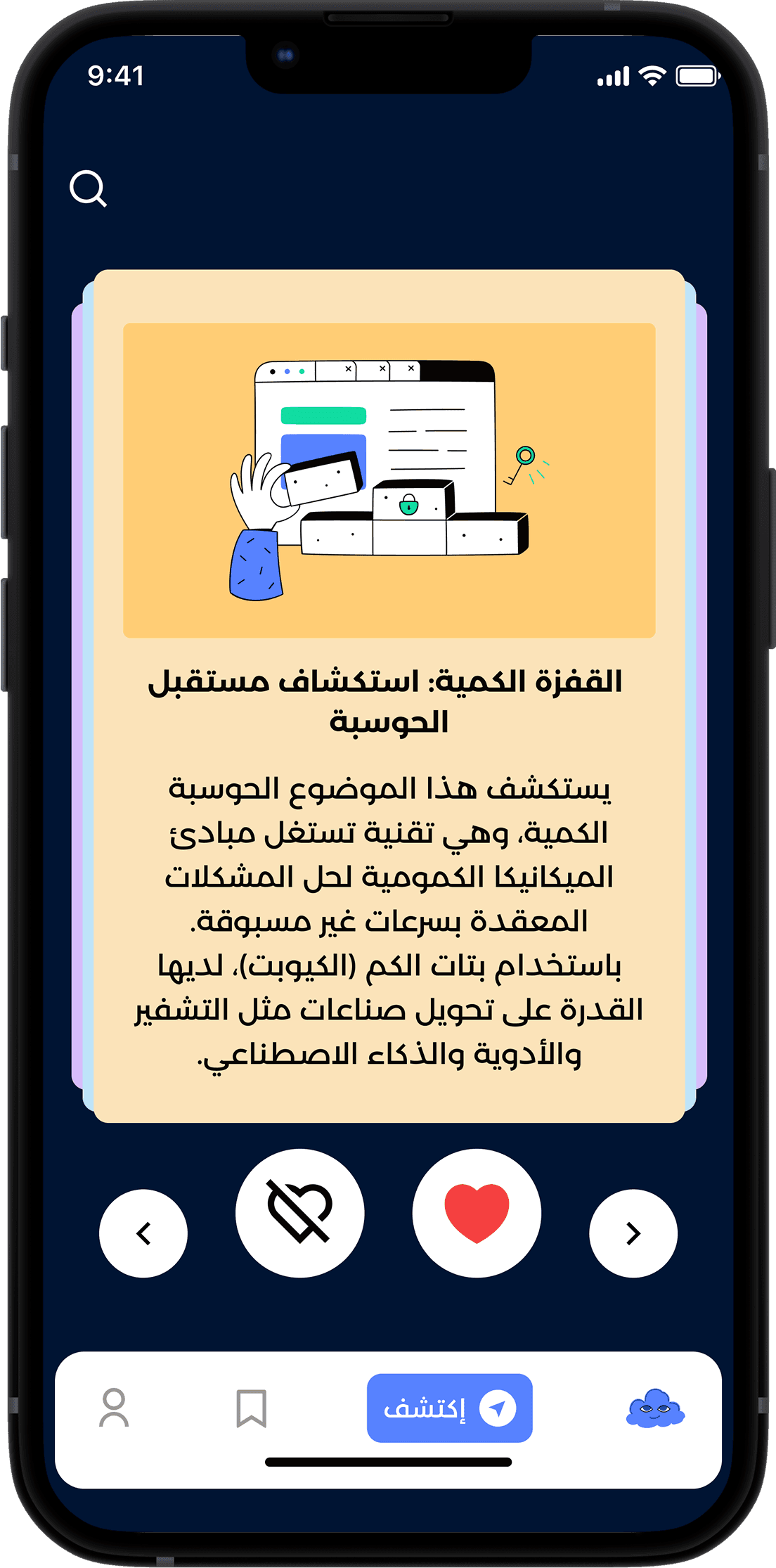
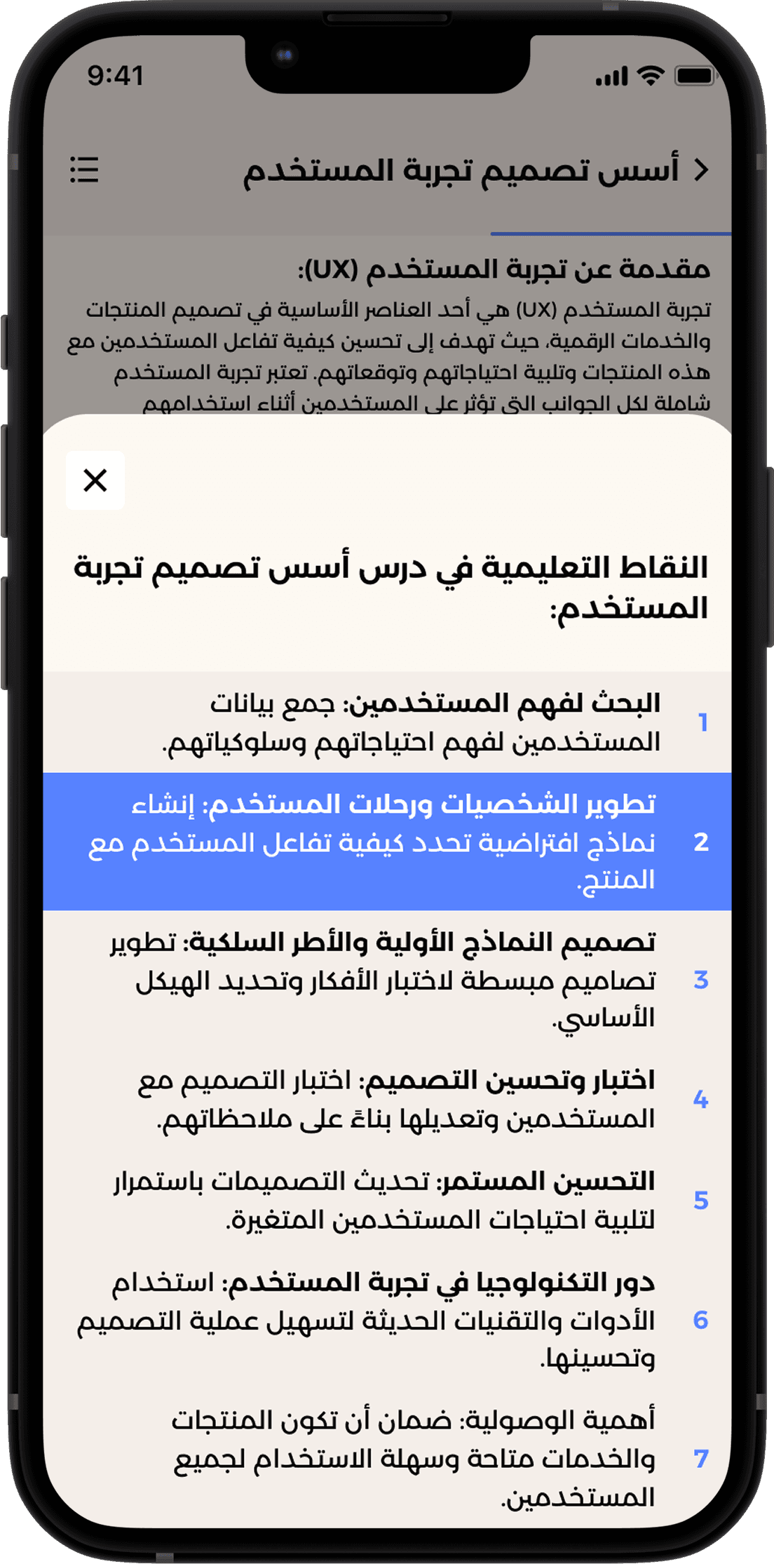
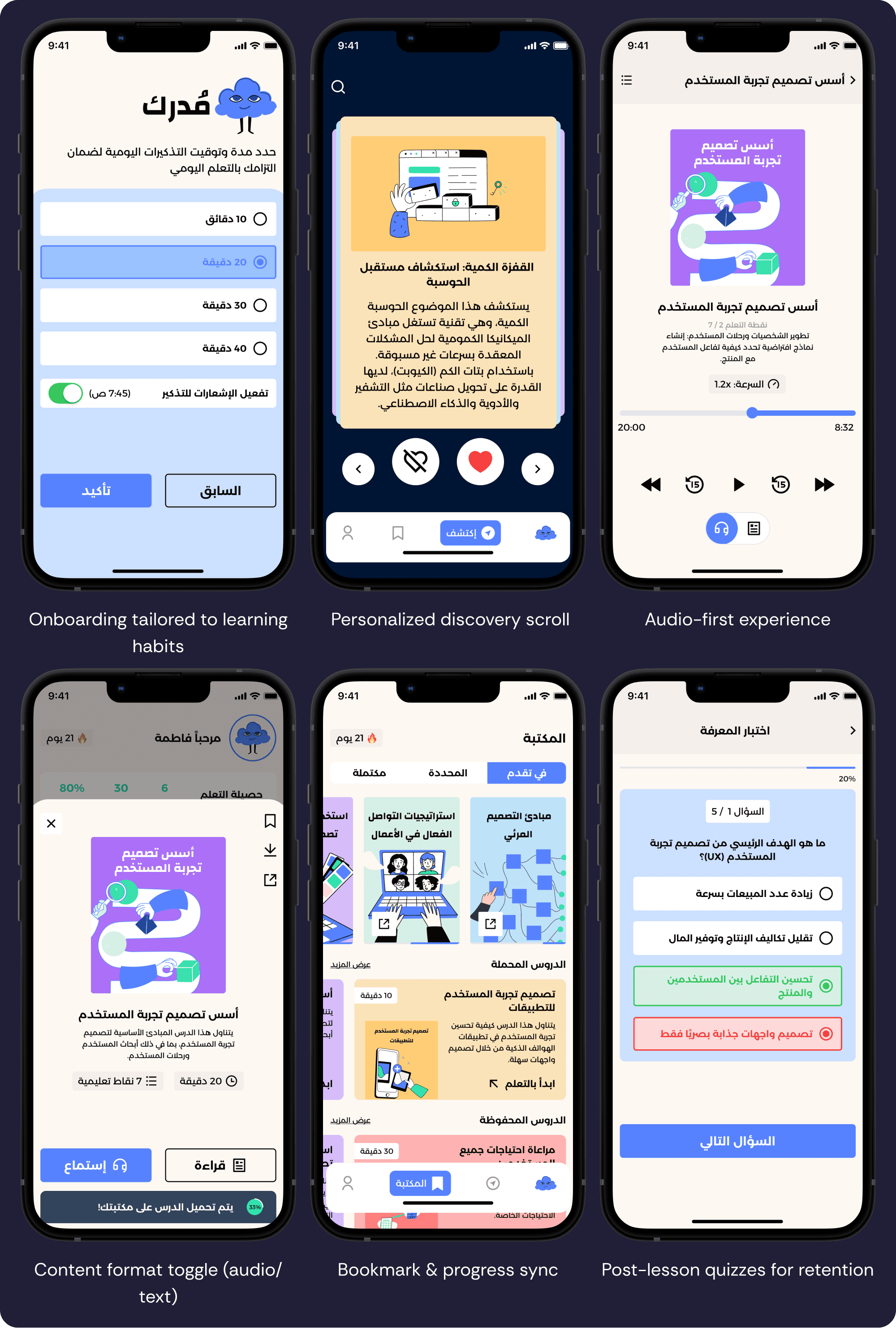
Solution Breakdown
Usability Testing: Validating the Experience
Participants: 5 users (3 students, 2 professionals).
Method: Remote moderated sessions via Google Meet using the think-aloud protocol.
Tasks Tested:
Account sign-up and onboarding.
Completing a lesson.
Taking a post-lesson quiz.
Using the discovery scroll feature.
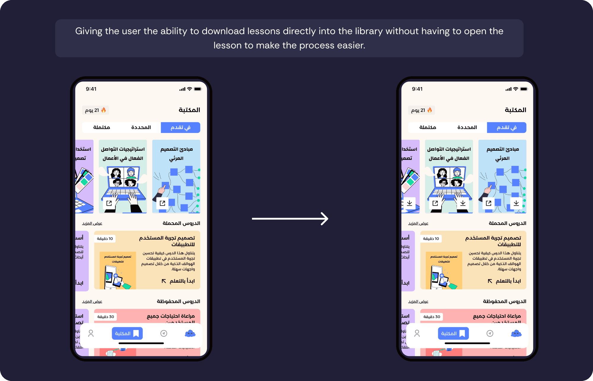
Bookmarking a lesson for later.
Metrics:
4 out of 5 users completed all tasks.
Average session ratings: 4.2 / 5.
Lesson duration: ~4 minutes.
Common issues:
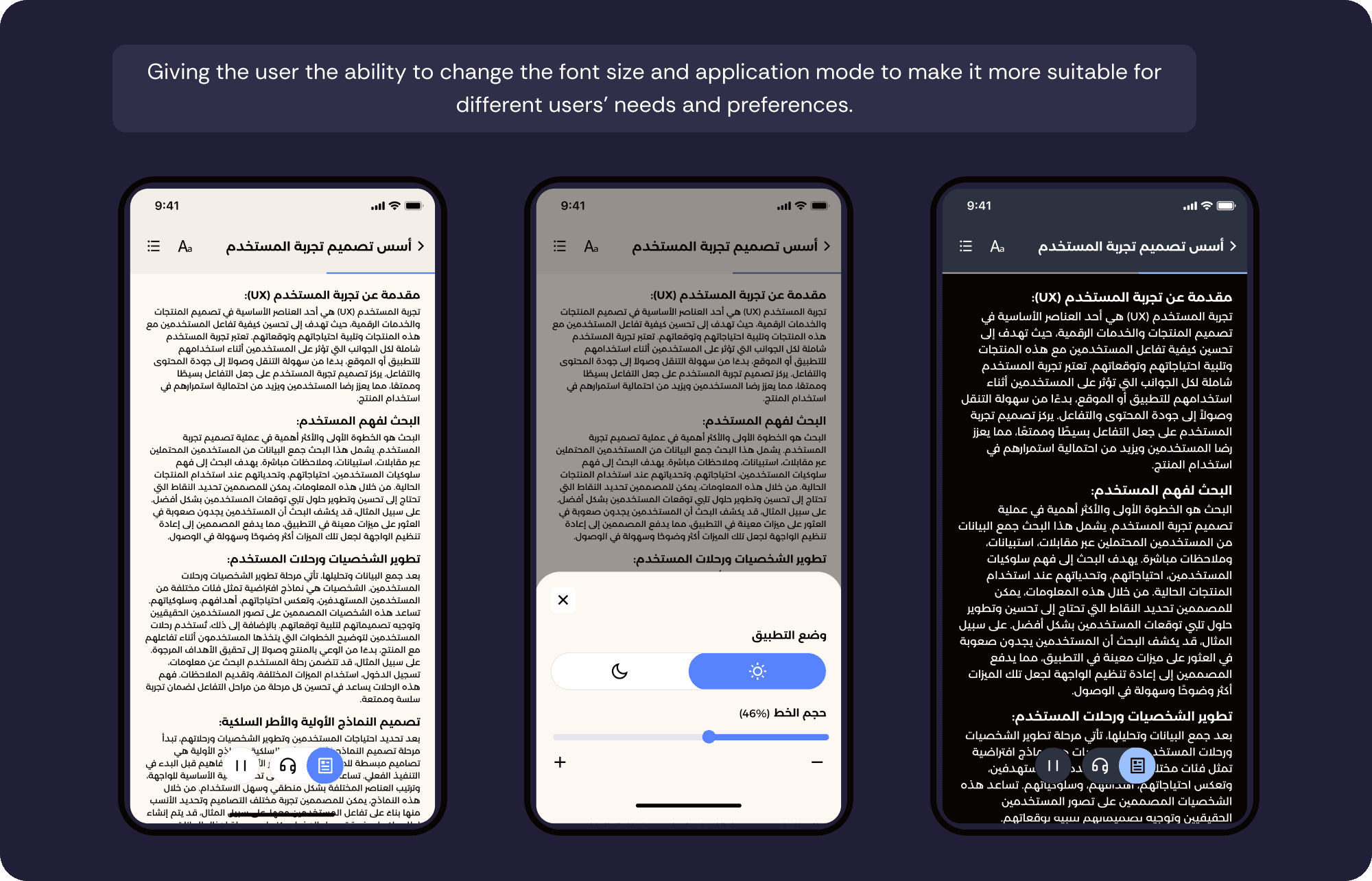
Difficulty reading small text.
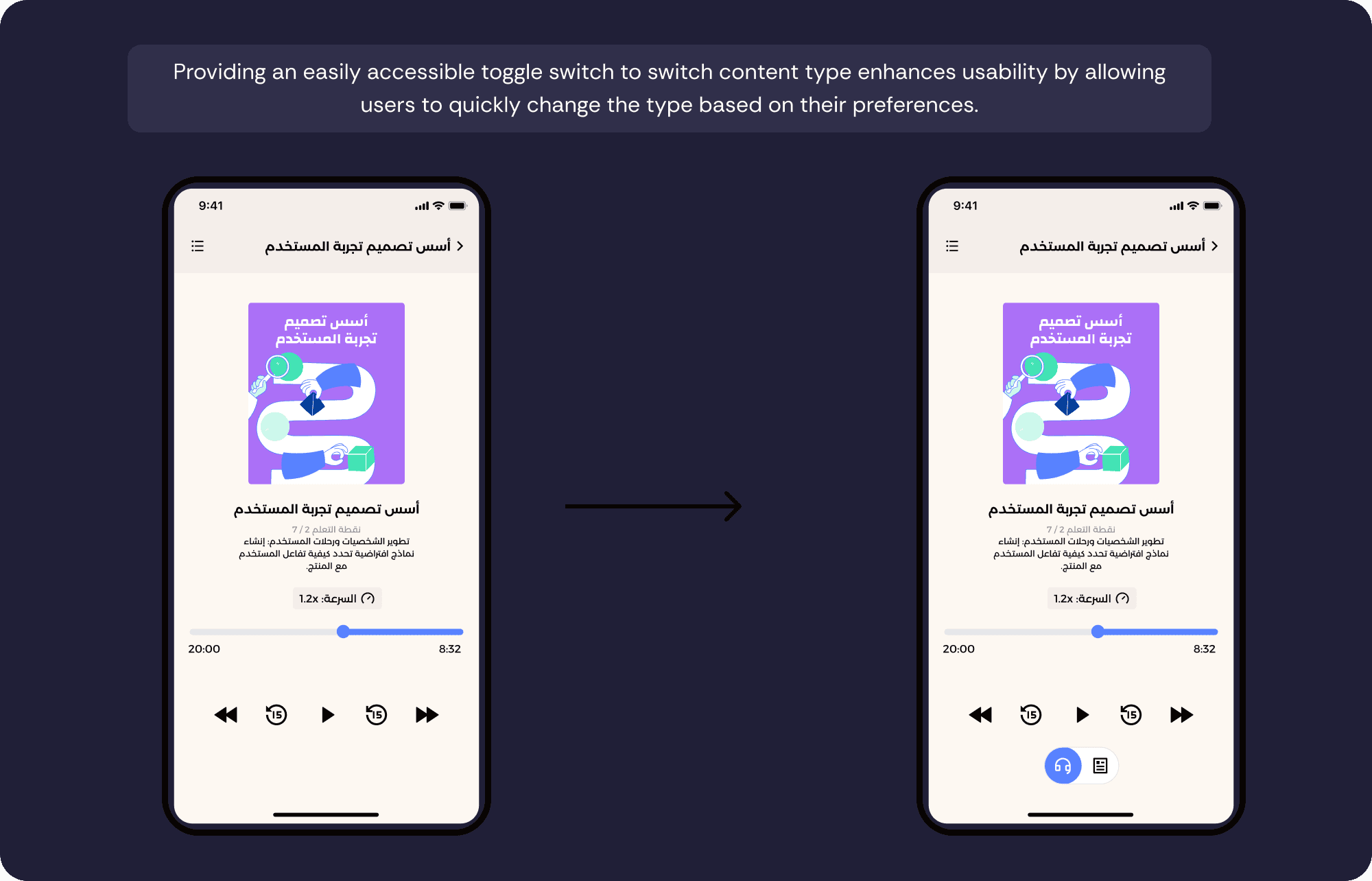
Unclear toggle between text and audio.
Users overlooked swipe feature in discovery.
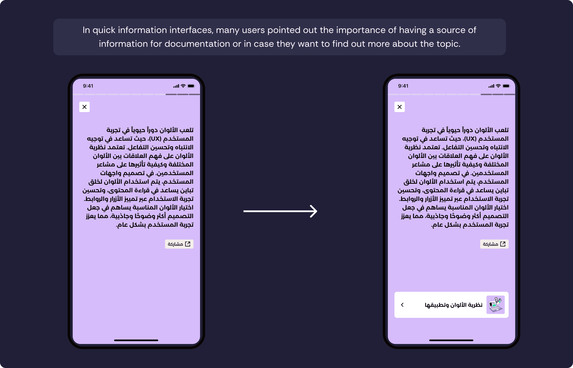
Redesigning Decisions

What I Learned
Validate early. Real users debunk assumptions fast.
Accessibility is foundational—not optional.
Small features like tooltips, toggles, and font scaling build trust.
Flexibility matters. Users want control—but without complexity.
Next Steps
Implement dark mode for night-time reading comfort.
Use AI to recommend personalized lessons.
Add an AI-powered assistant for real-time support and content Q&A.
In the end, this app isn’t just about consuming knowledge. It’s about making learning feel effortless, everyday, and empowering.

