


Problem Statement: The Struggle for Structure in Remote Work
Remote work offers flexibility—but it often hides structural pitfalls. Remote workers, initially enjoyed the benefits: no commute, fewer distractions, and greater autonomy. Yet, over time, long hours at a desk replaced natural movement, leading to backaches, fatigue, and declining mental health. His experience reflects a wider trend:
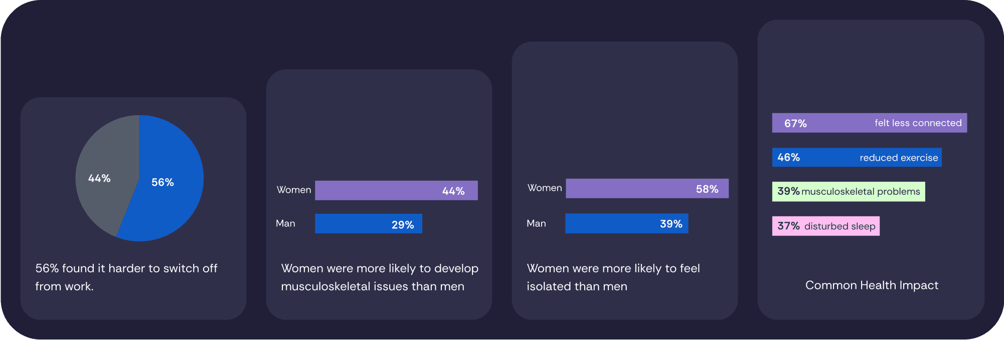
Remote employees sit for 74% of their workday—compared to 50% for office workers.
Light physical activity dropped to just 14% of their day (vs. 29% in-office).
56% of remote workers struggle to switch off from work.
Women are more prone to musculoskeletal issues and feelings of isolation.
(Source: RSPH survey on home working health impacts)
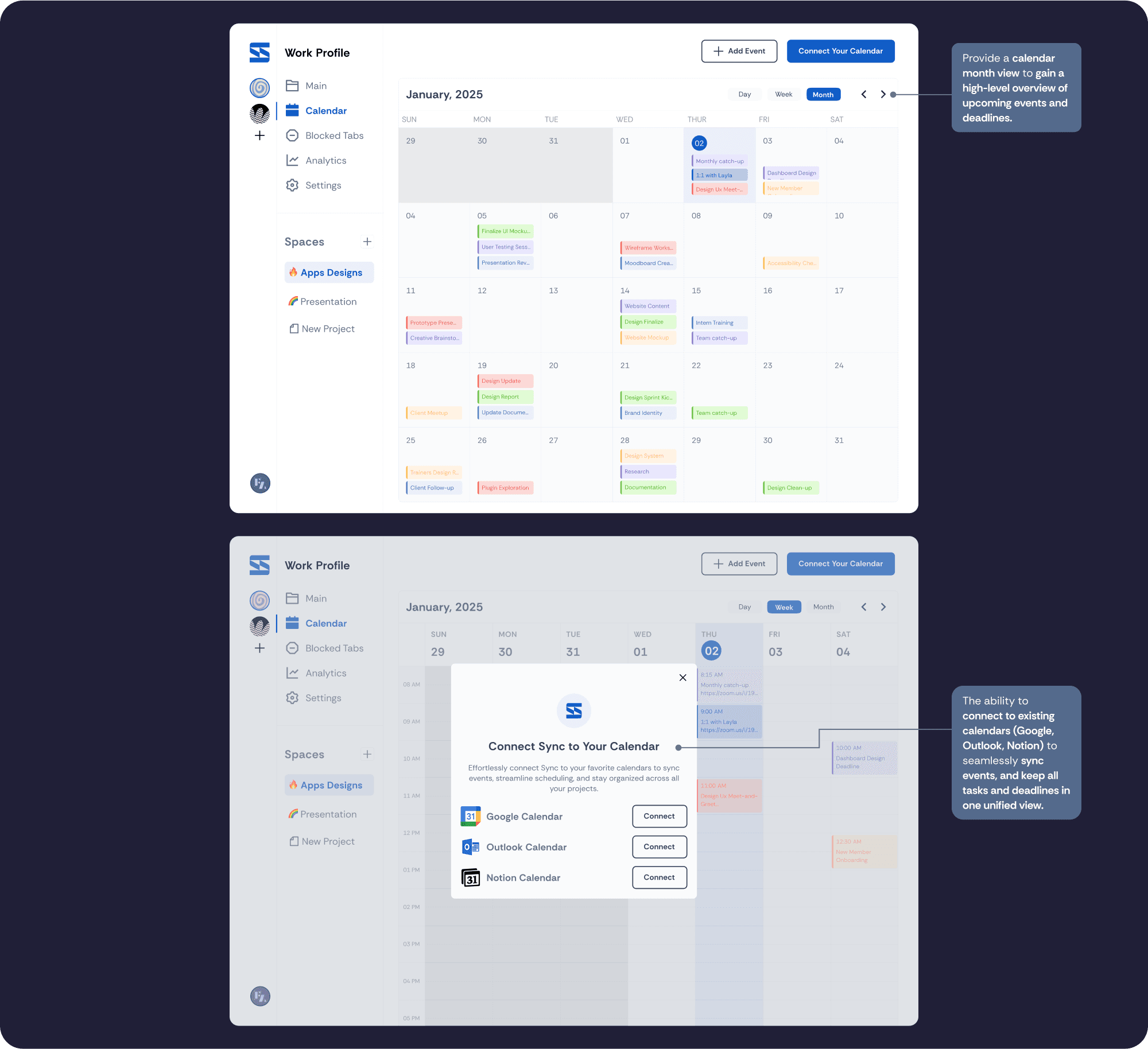
Beyond physical health, many remote workers face fragmented workflows. Tools like calendars and task managers operate in silos, making it difficult to stay organized, protect focus time, and achieve work-life balance. This fragmentation leads to inefficiency, burnout, and lack of structure.
Solution Overview: Bridging the Gap
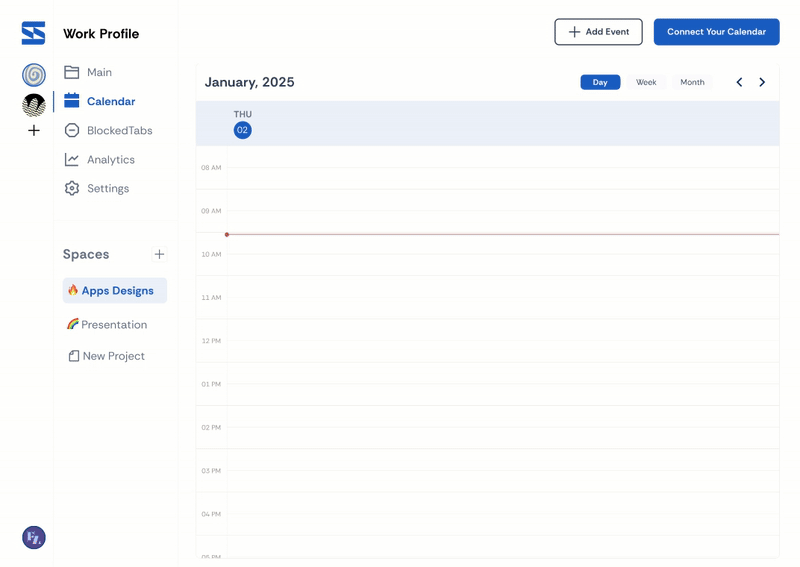
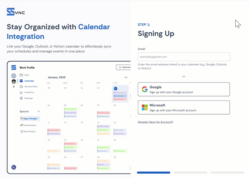
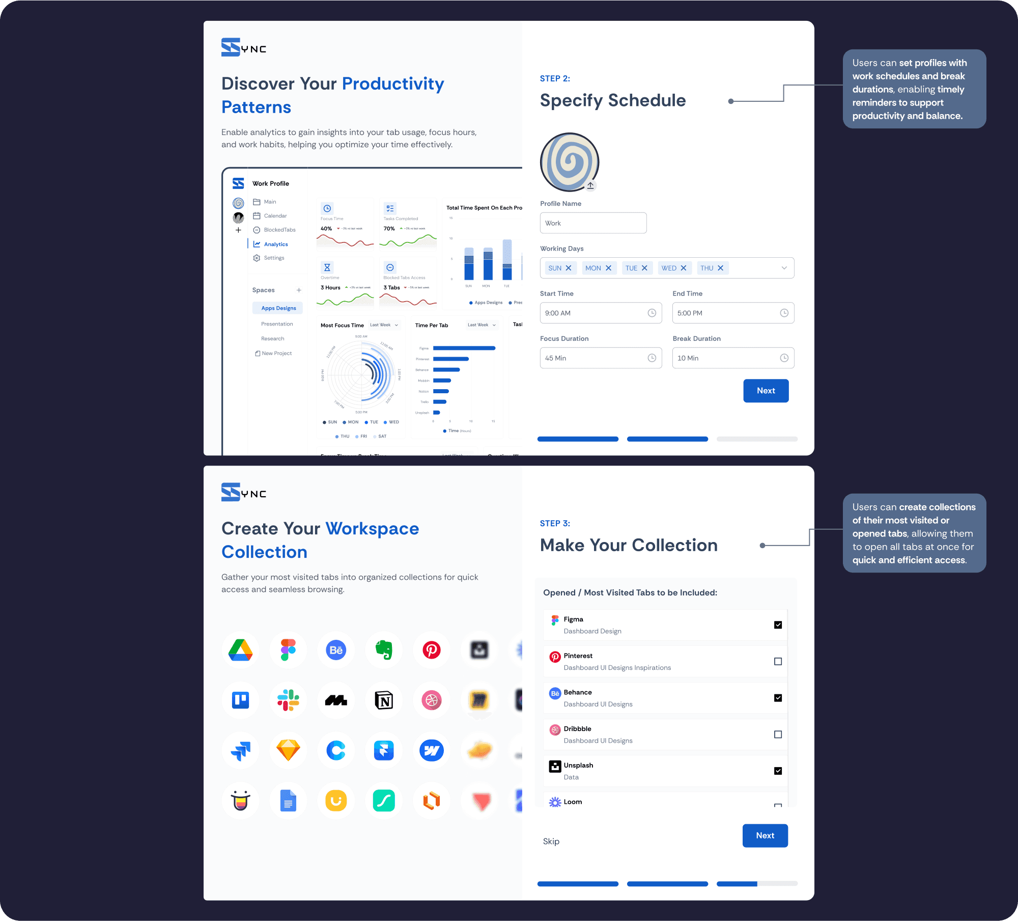
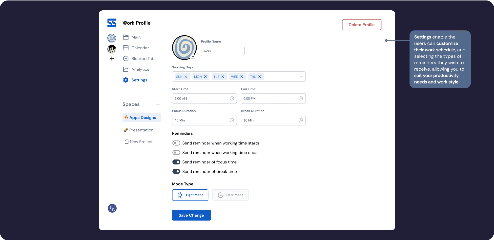
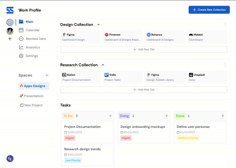
To combat this, I designed a browser extension that unifies task management, calendar integration, and tab organization—empowering remote workers to regain control over their digital environment. Key features include:

My Role
As the UX Designer, I used design thinking to explore the problem space, conducted interviews and surveys to validate user pain points, and translated insights into wireframes and prototypes.
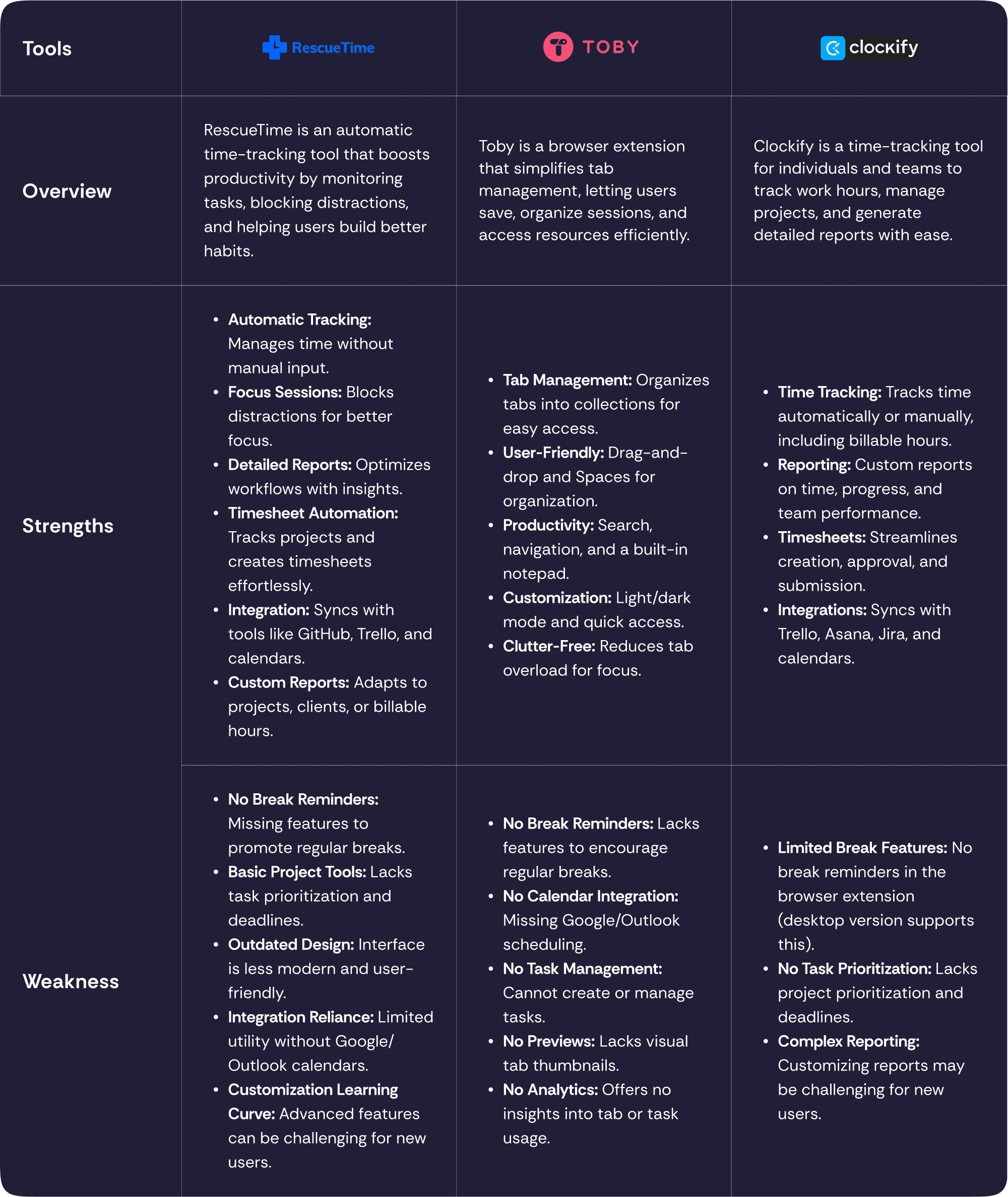
Competitive Analysis
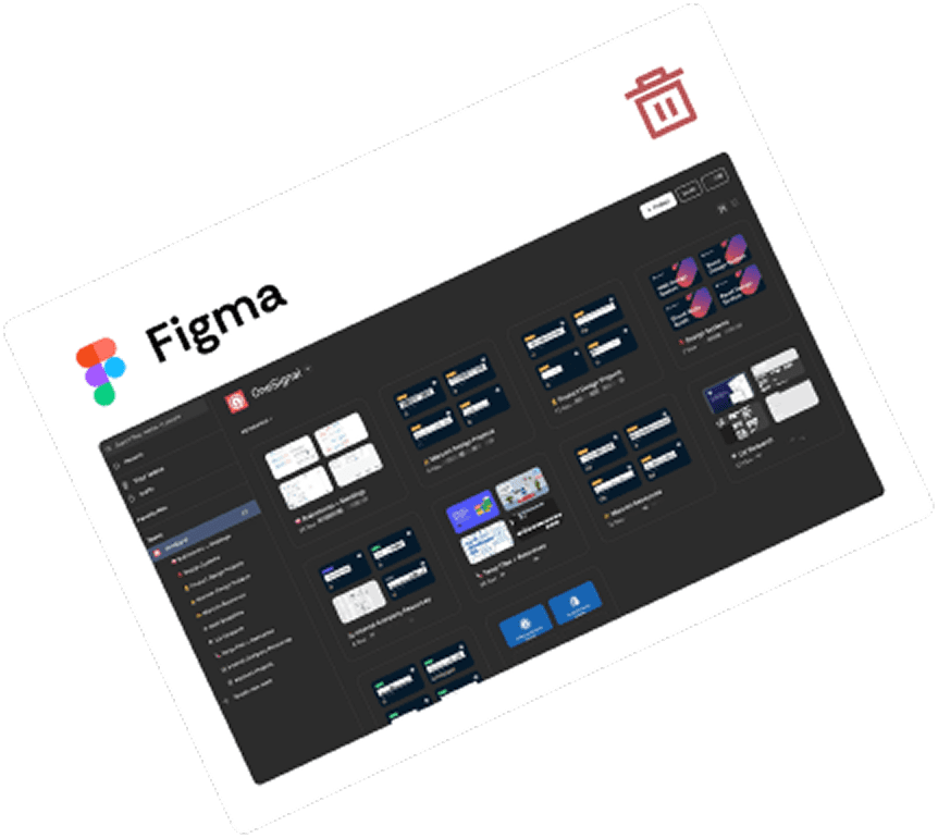
I began by evaluating tools like RescueTime, Toby, and Clockify to understand current solutions for tab management, time tracking, calendar integration, and productivity analytics. While each tool had strengths—like automatic tracking or user-friendly tab organization—they also lacked cohesive features:
No break reminders or wellness nudges
Missing or limited calendar integration
No unified task and tab management
Complex or outdated interfaces
These insights helped shape a clear opportunity space: design a browser extension that offers structured task organization, intelligent time planning, and healthy work habits in a single, intuitive platform.
User Research
To guide the solution, I created a persona—Layan Mohammed, a UX designer working remotely. Her goals and frustrations reflected many real users:
Struggles to disconnect after hours
Difficulty maintaining structure and focus
Reliance on scattered tools (Notion, Google Calendar, etc.)
Motivation to balance productivity and personal time
This persona shaped every design decision to ensure features aligned with real-world needs.

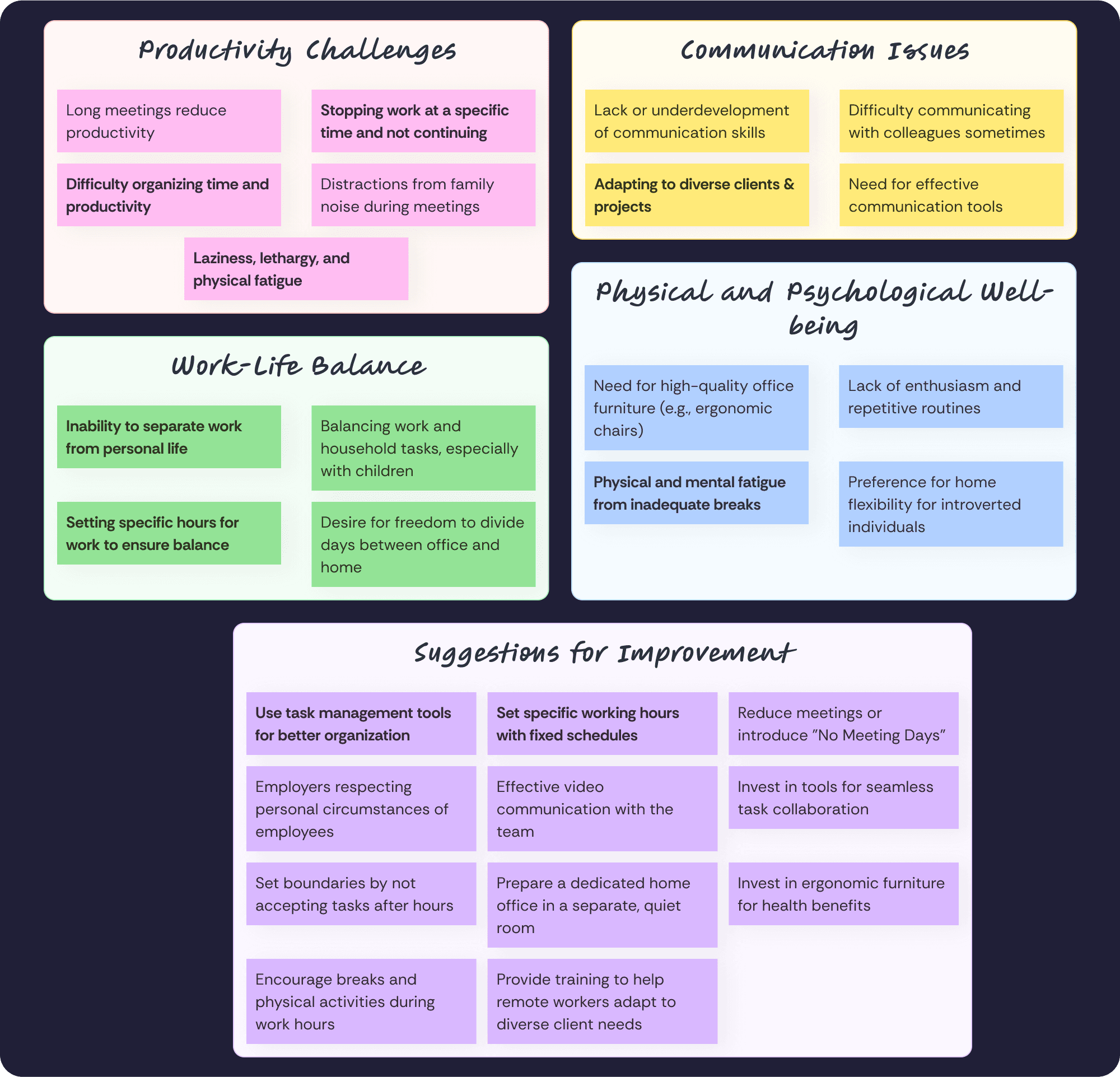
Affinity Mapping: Identifying Key Themes
By analyzing interviews and survey findings, I organized key pain points into an affinity diagram, focusing on digital workspace management. Themes included:
Fragmentation across tools
Lack of physical activity cues
Difficulty switching mental contexts between work and personal life
Ineffective tab and task organization
Ideation: Framing Opportunities with HMW Questions
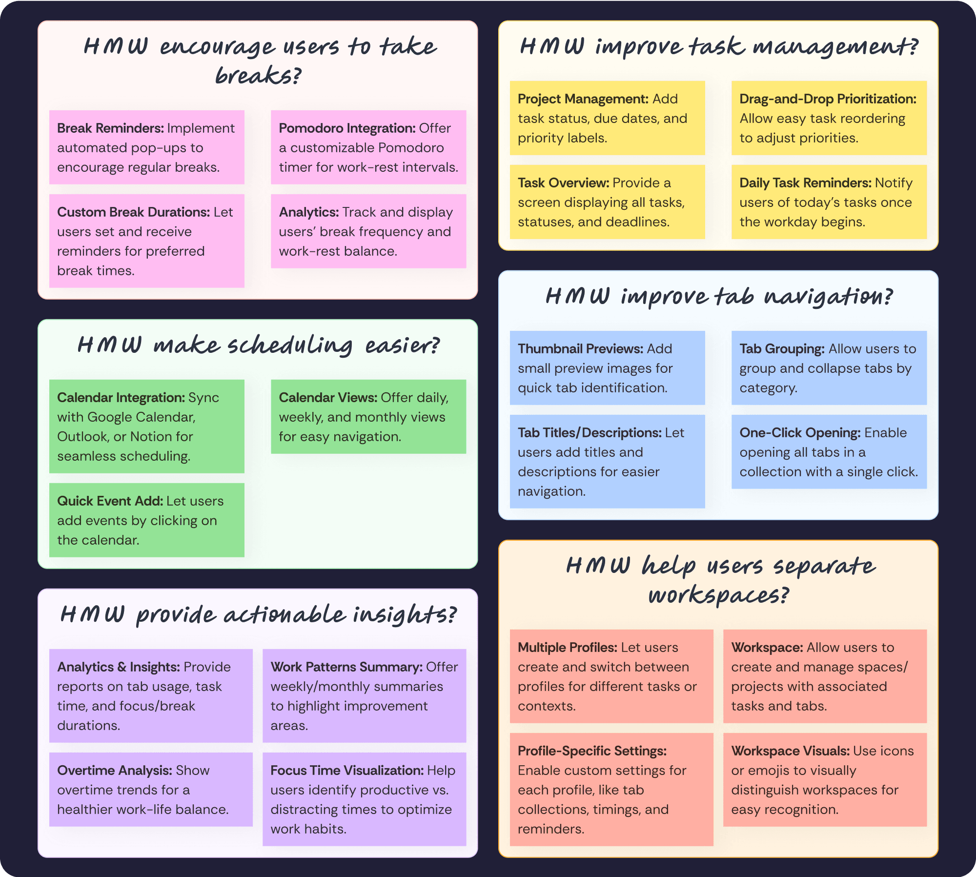
I used “How Might We” questions to turn pain points into actionable design opportunities:
HMW encourage users to take breaks?
HMW improve task management?
HMW improve tab navigation?
HMW make scheduling easier?
HMW provide actionable insights?
HMW help users separate workspaces?
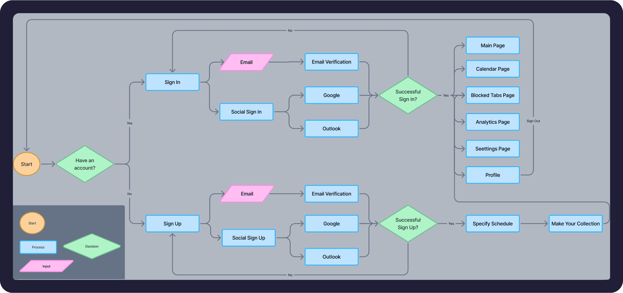
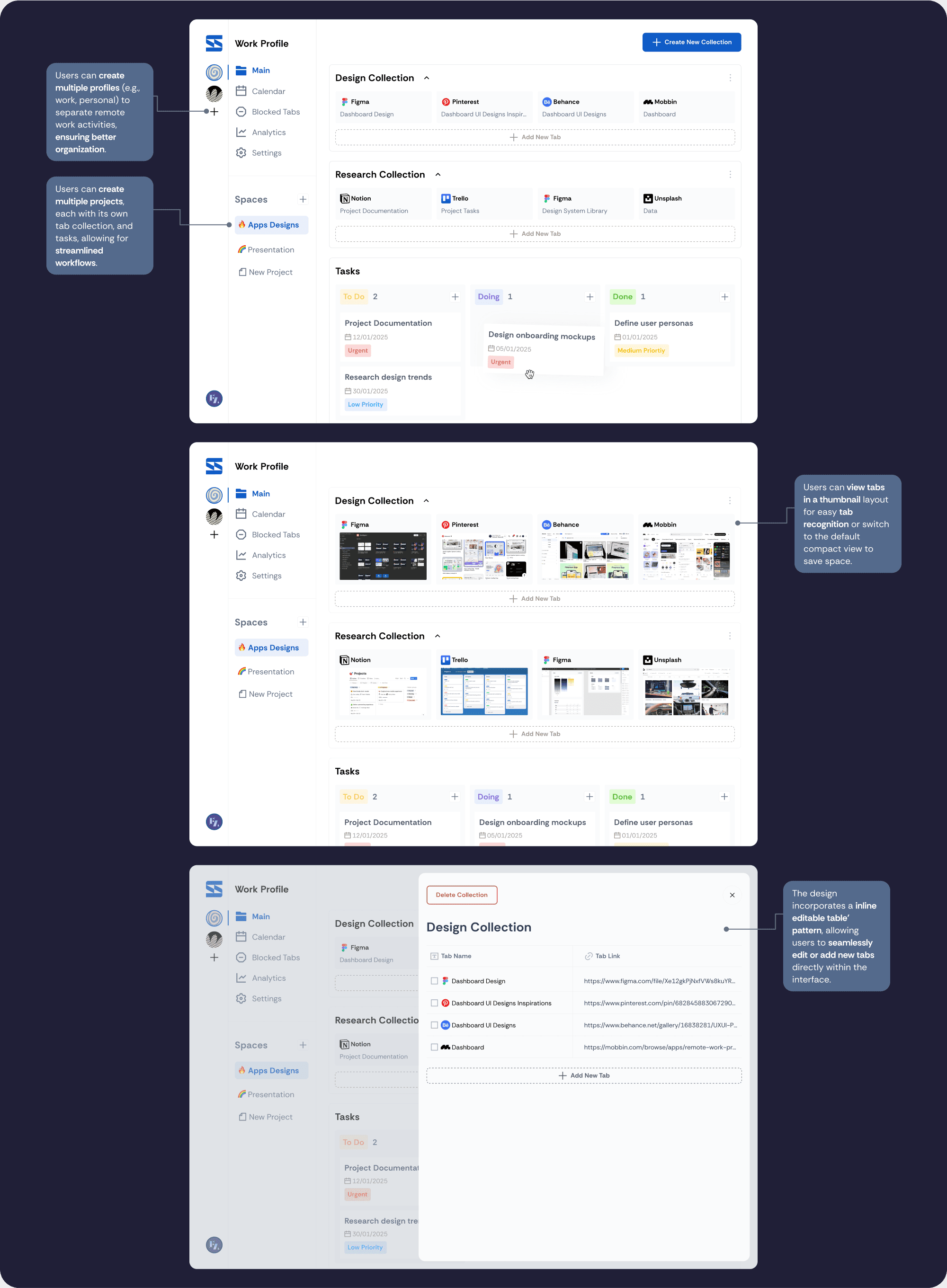
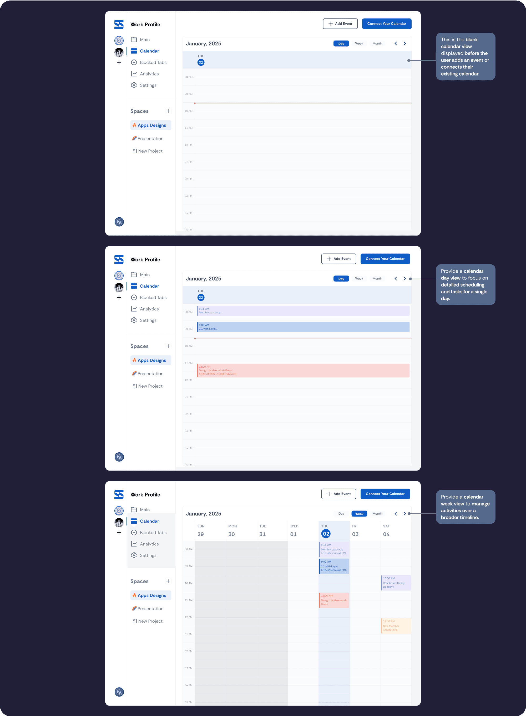
Information Architecture and User Flow
With clear features in mind, I developed the Information Architecture (IA) to structure the core functionality, followed by a user flow to visualize how users would move through the extension—from onboarding, to creating tasks, to analyzing productivity.
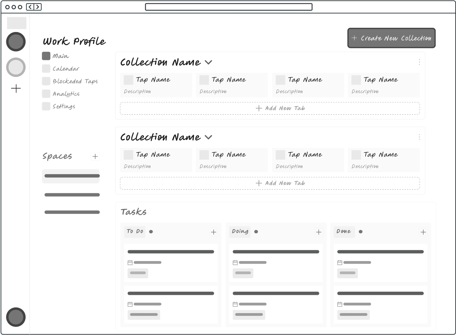
Wireframe Iterations: Evolving Through Feedback
1st Iteration: Focused on core layout and navigation
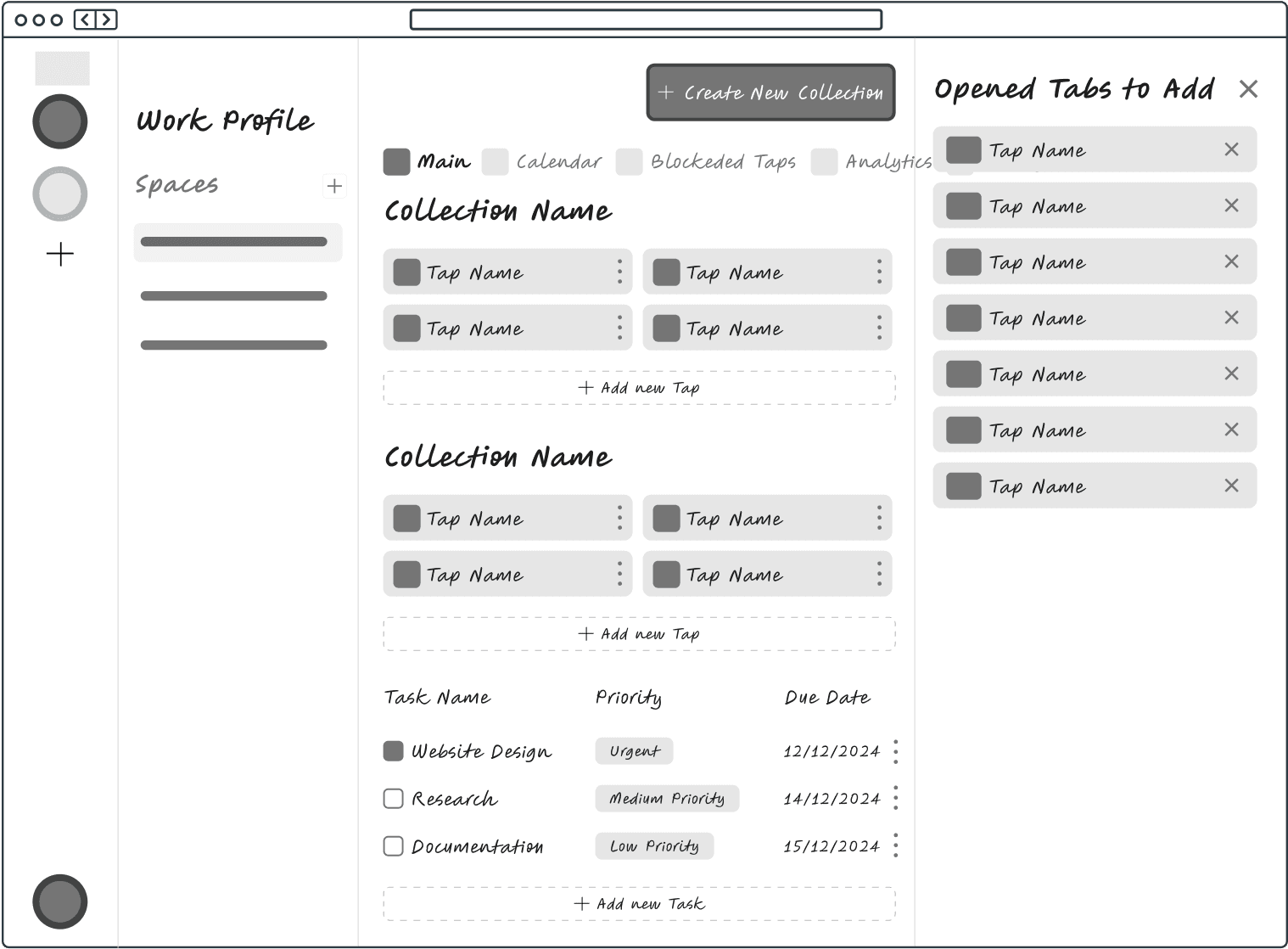
2nd Iteration: Moved tab collection setup to onboarding; simplified card interactions
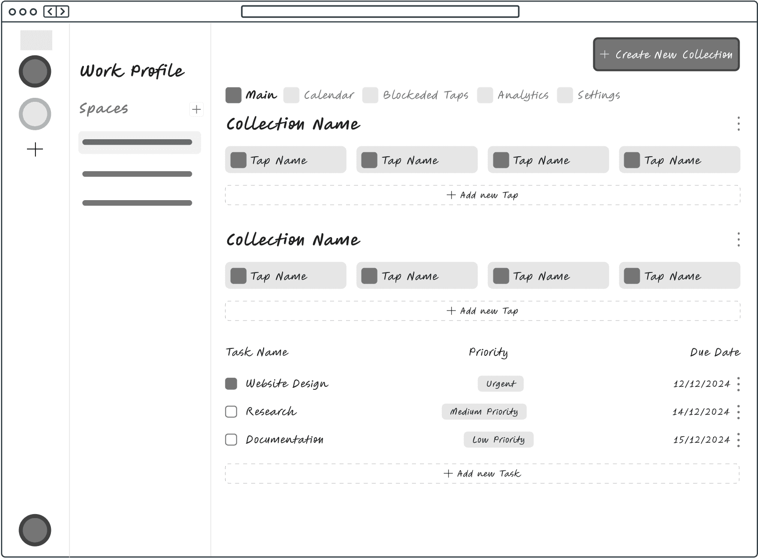
3rd Iteration: Shifted navigation sidebar to clarify that some features (e.g., Calendar, Analytics) are shared across projects
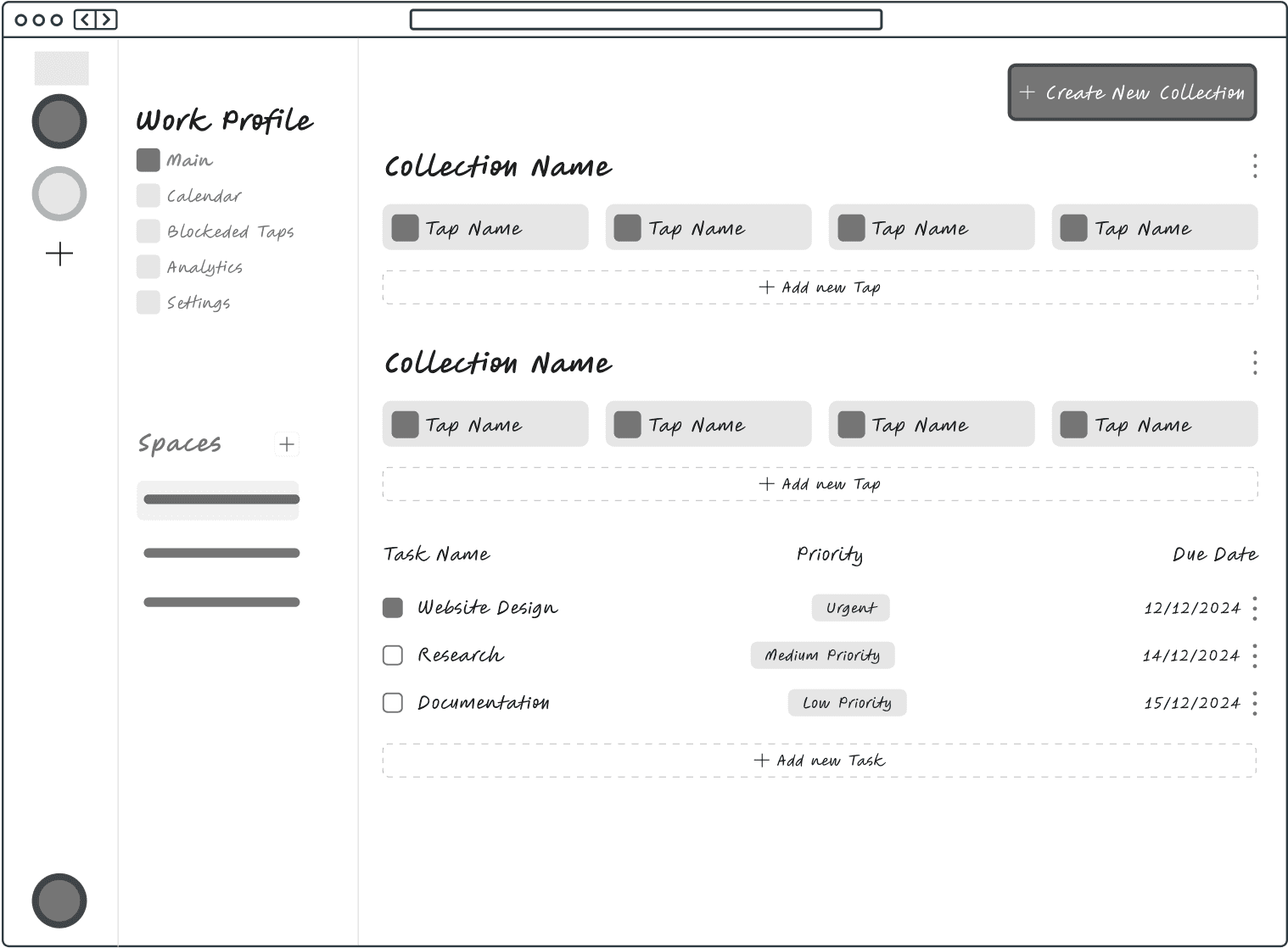
4th Iteration: Added tab descriptions to help distinguish similar links
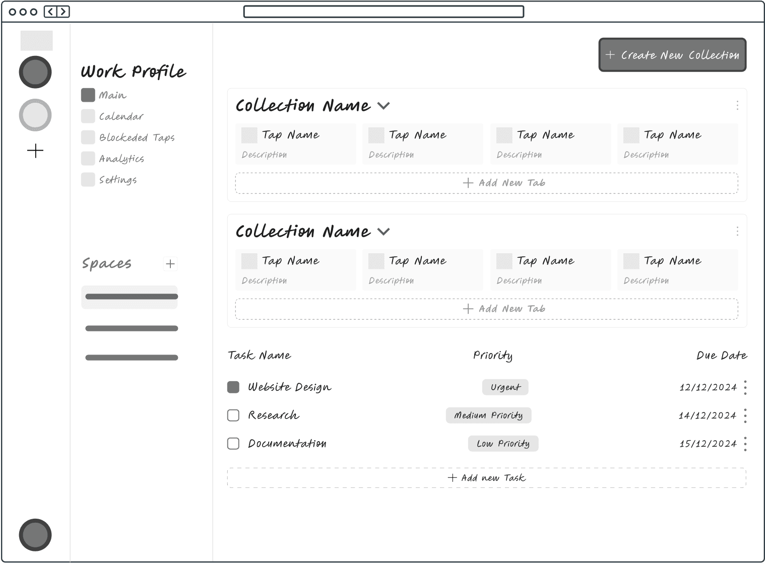
5th Iteration: Transformed the task list into a drag-and-drop Kanban board for better visual task management
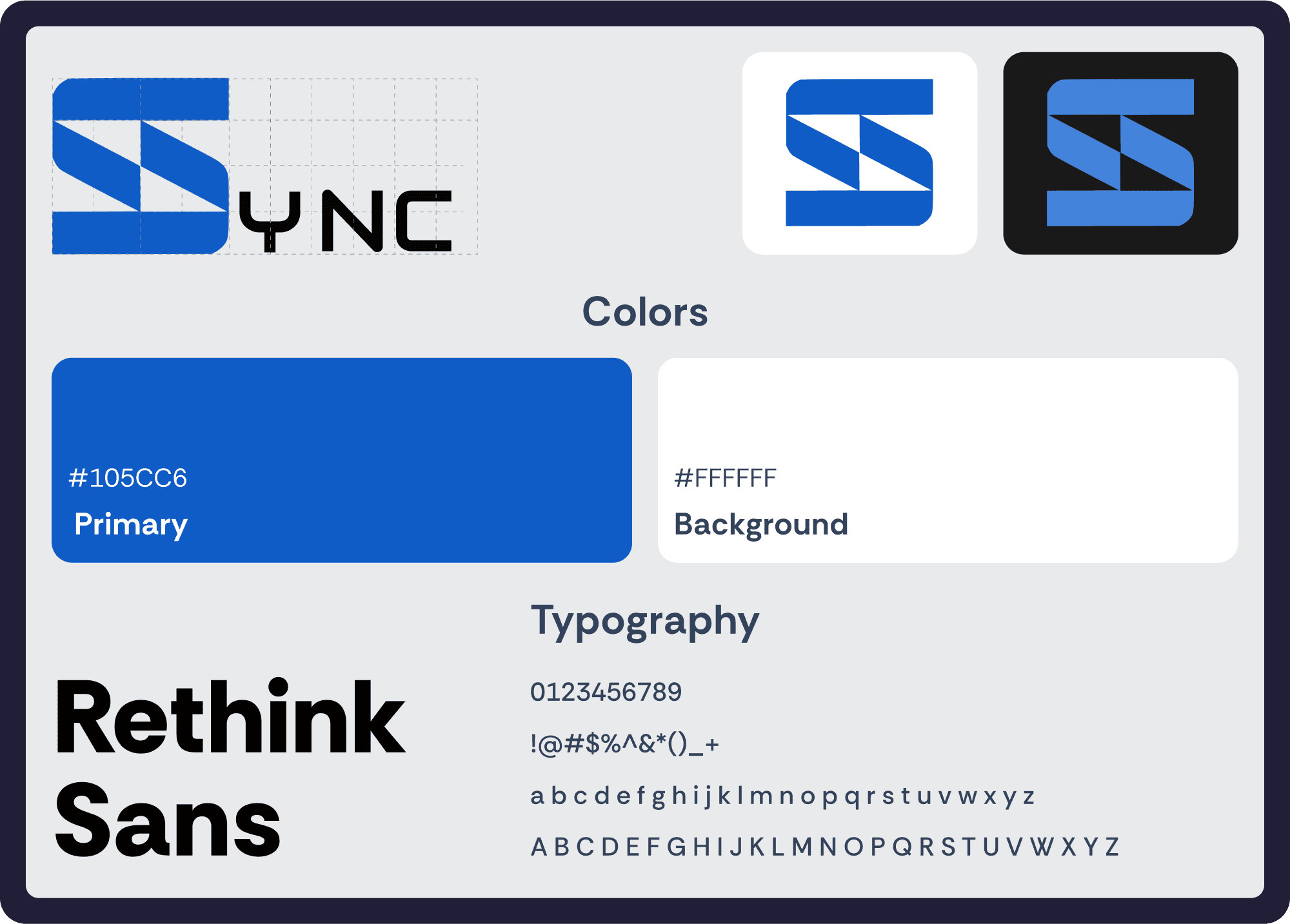
Design System: Style Guide & Dark Mode
I built a consistent visual identity, including a logo, typography, and component library. Using Figma Local Variables, I implemented Dark Mode for visual comfort and accessibility.

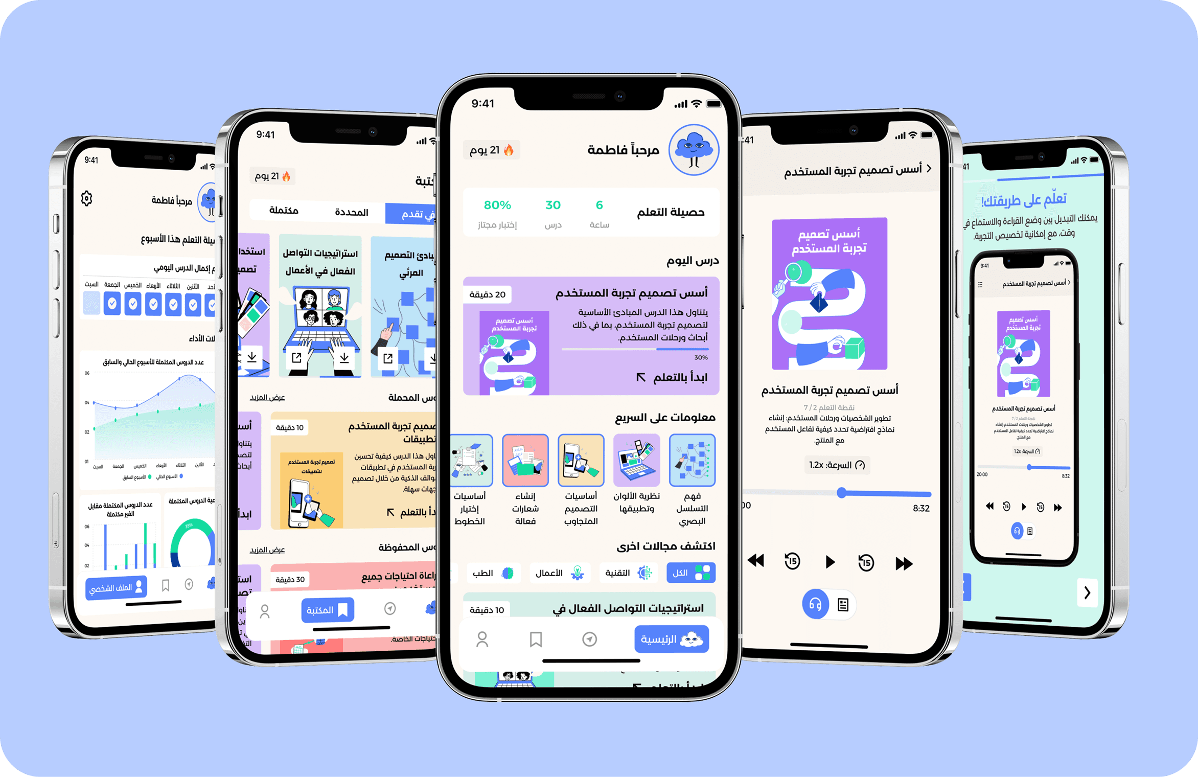
Solution Breakdown
Usability Testing: Validating the Experience
I tested the prototype with 3 remote workers. Key insights:
Onboarding was clear and smooth
Users intuitively managed tabs and created tasks
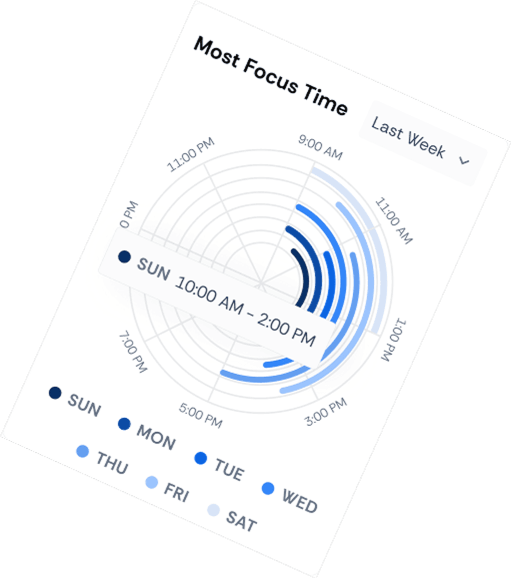
Calendar integration and analytics were well-received
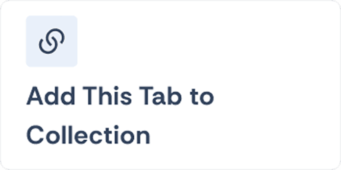
Confusion arose from an unlabeled “open all tabs” icon → tooltip added
Conclusion & Lessons Learned
As a UX Designer—and a remote worker for over 5 years—I created Sync to solve common but under-addressed challenges: context-switching fatigue, unstructured workflows, and the need for healthier habits while working remotely.
This project taught me:
Real users reveal the real problems. I learned to validate early and often, avoiding assumptions based on my own habits.
Micro-interactions matter. Small enhancements, like hover-to-delete or tooltips, significantly improved usability.
Design is a balancing act. Users want flexibility and structure—building a tool that supports both required thoughtful decisions across IA, flow, and UI.
Ultimately, Sync isn’t just about productivity—it’s about helping remote workers thrive in their digital workspace with structure, intention, and balance.