

Introduction
As part of a product designer job application, I was given a two-day design challenge to showcase my problem-solving and design skills.
The task involved:
Redesigning the loyalty points exchange flow
Enhancing the "My Cards" screen within the wallet feature
My goal was to improve usability, functionality, and alignment with business objectives—creating a more intuitive, user-focused experience.
Disclaimer: This solution is a concept I created independently for a design challenge and is not affiliated with the company's official product.
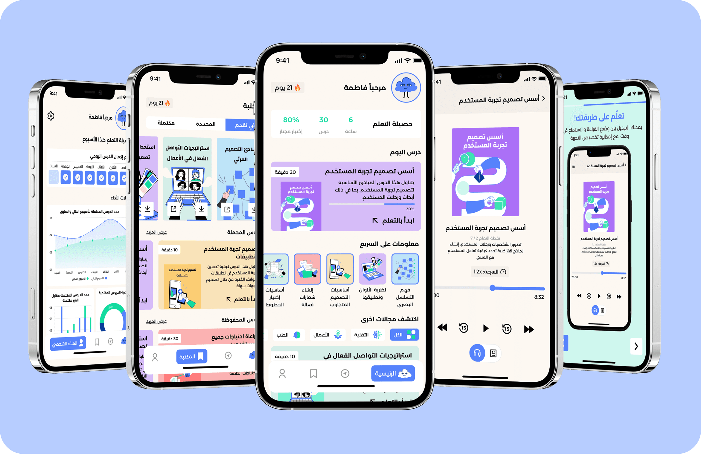
The new feature allows users to
Understanding the Challenge
UX Research Methodology: Due to limited time and resources, I conducted a heuristic evaluation to assess usability issues. No analytics or user data was provided, and user interviews were not feasible. The evaluation relied on Jakob Nielsen’s heuristics and key cognitive principles (Fitts’s Law, Hick’s Law, Zeigarnik Effect).
1. Discover Stage: Key Problems Identified
Problems Discovered in My Cards Screen:

Problems Discovered in Loyalty Exchange Flow:
Prioritizing Issues by Severity and Effort:
The issues are prioritized based on the severity (S) guide and ease of fix (E) to prioritize making the changes based on the impact
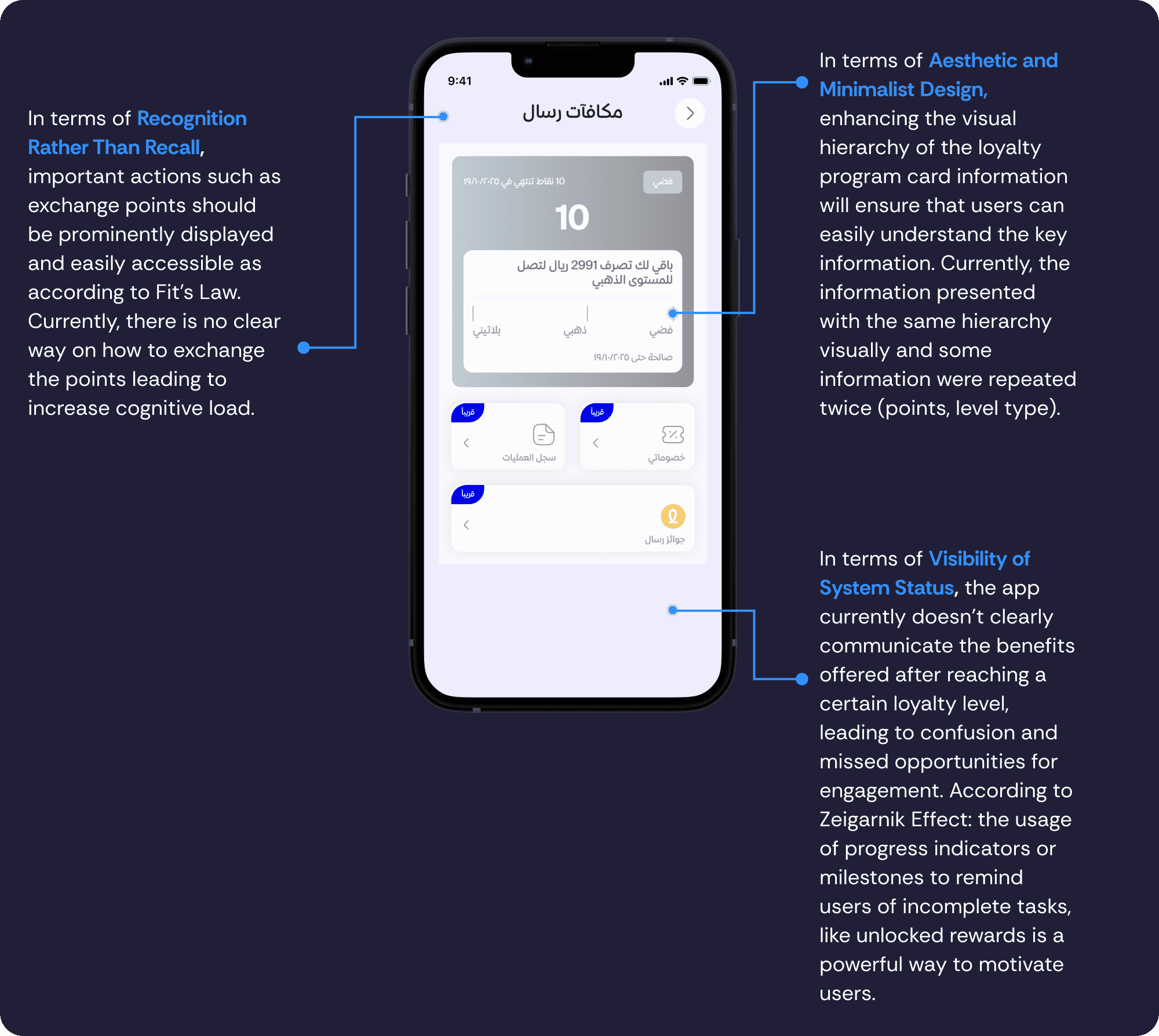
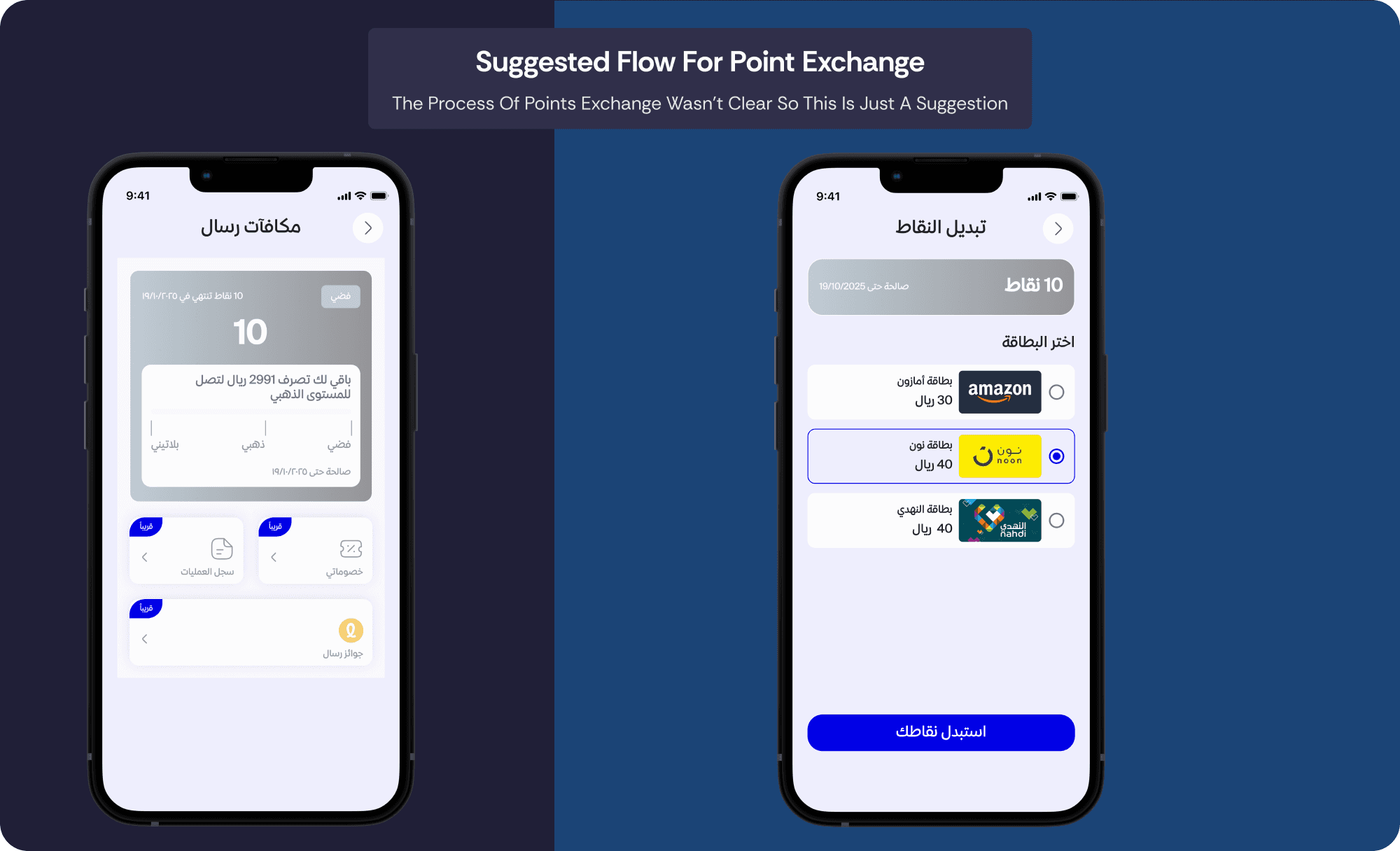
S3 E3: No clear way to exchange points, increasing cognitive load.
S3 E3: Lack of filtering options to efficiently find relevant card types.
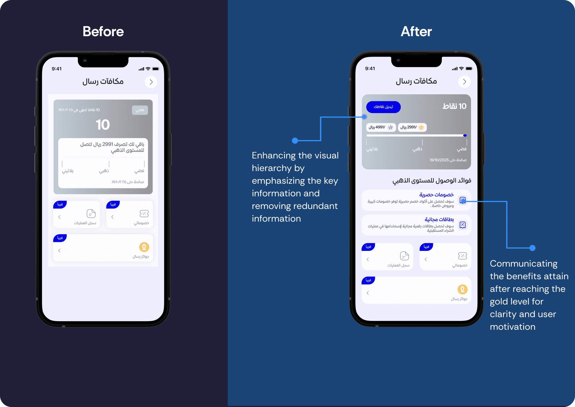
S3 E2: Confusing visual hierarchy with repeated information.
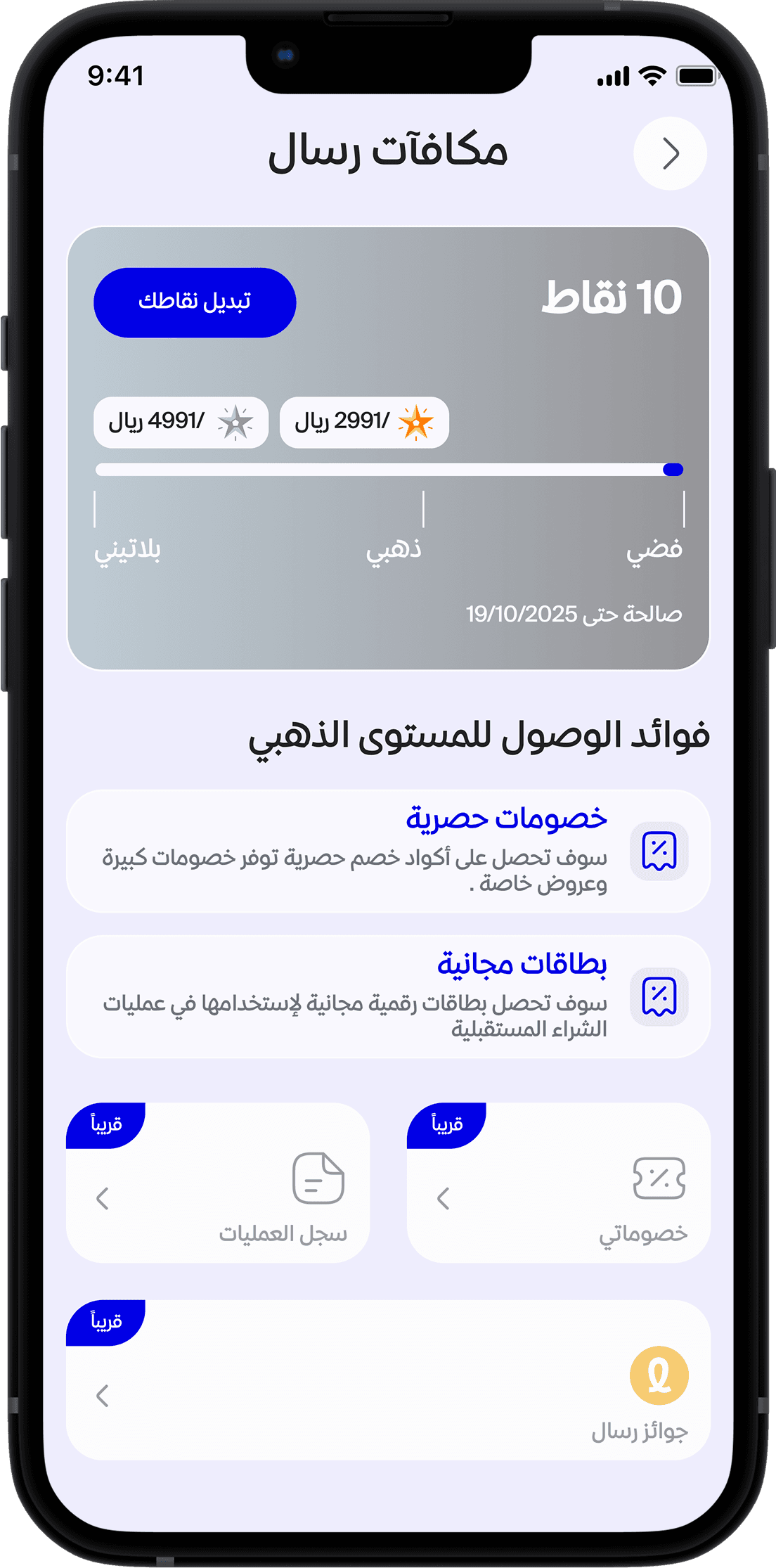
S2 E1: Lack of communication regarding loyalty benefits and progress indicators.
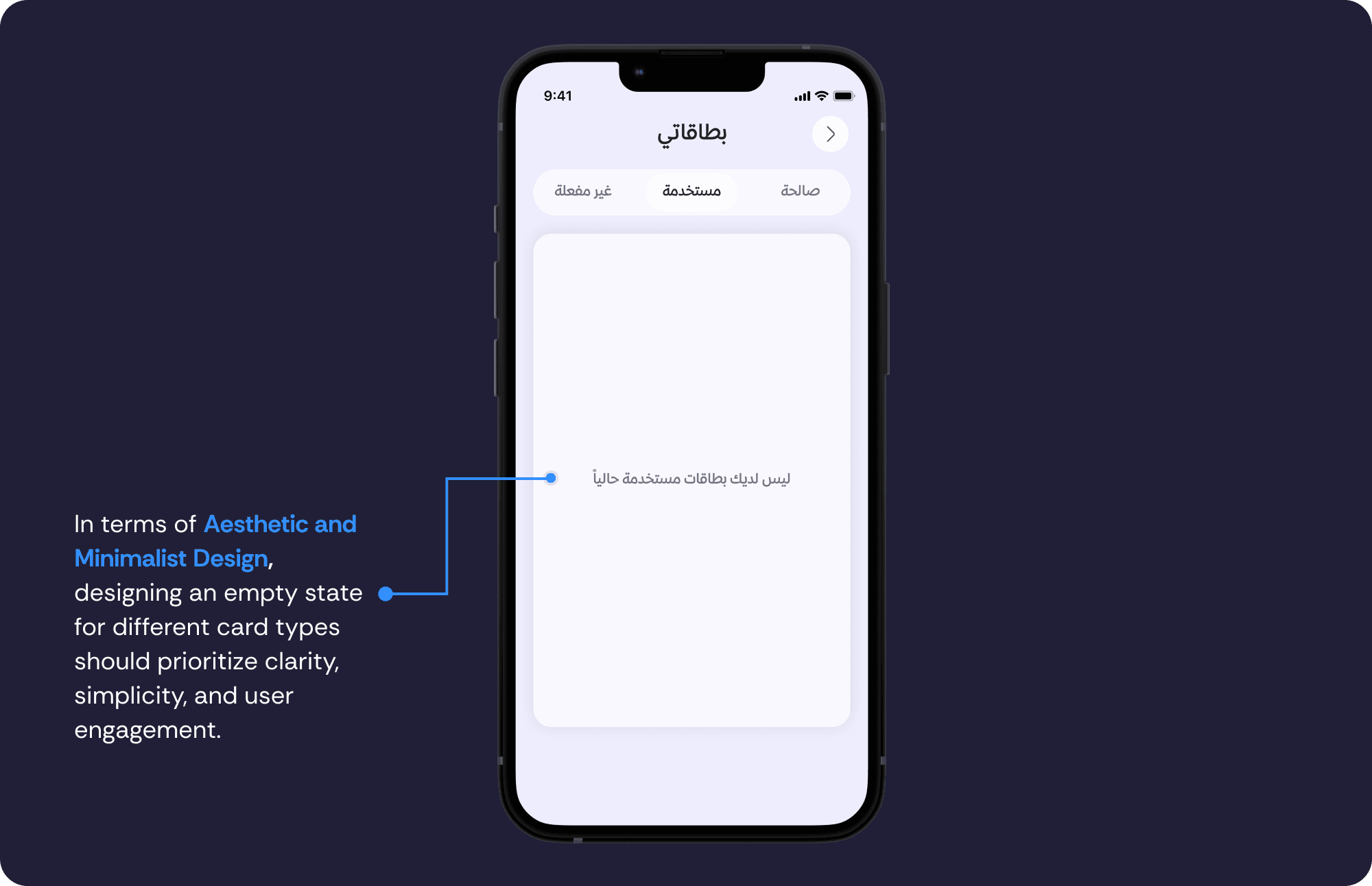
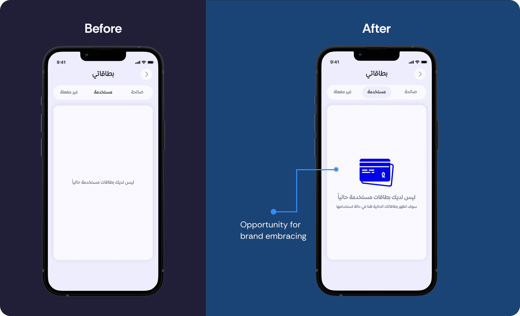
S1 E1: Poor empty state design that could confuse new users or users with no content.
Define Stage
Problem Statement:
The "My Cards" and loyalty program sections have usability issues that make it difficult for users to filter, manage, and share cards or redeem loyalty points. The unclear flow reduces engagement and increases cognitive load.
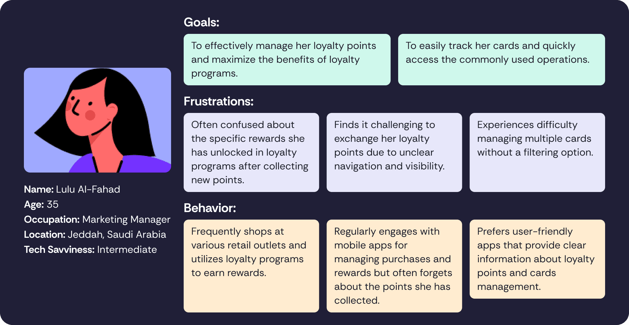
I created a persona to better understand the needs and frustrations of users interacting with both the loyalty points exchange flow and the "My Cards" screen. The purpose of this persona is to represent a typical user’s behavior, helping identify specific pain points
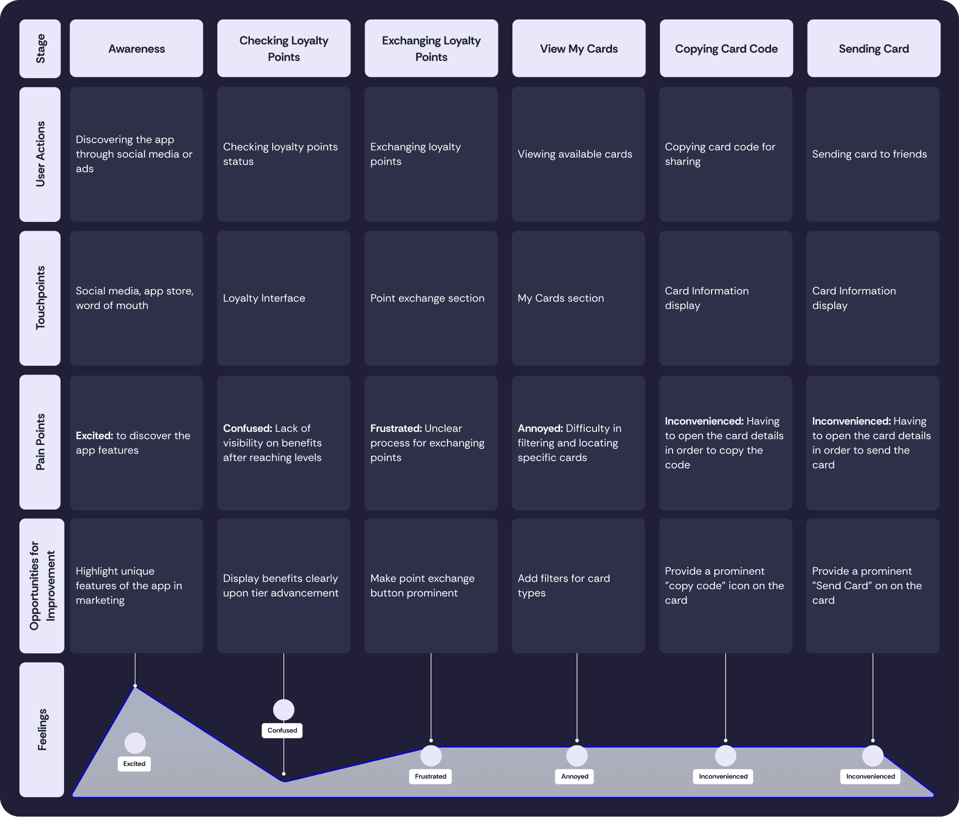
Customer Journey Map:
To identify key touchpoints, user emotions, and pain points throughout the user's experience, I created a customer journey map based on the persona and user story to visualize the user's interactions.
3. Ideate Stage
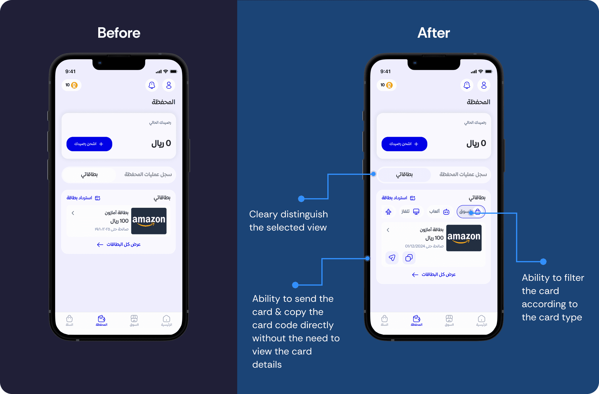
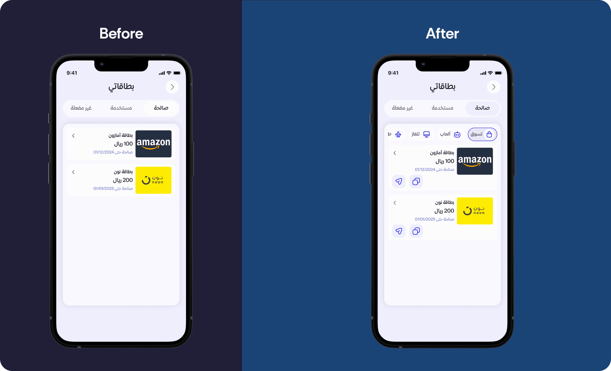
A. My Cards Solutions
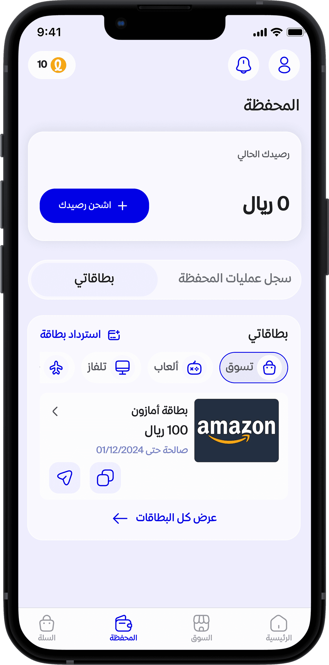
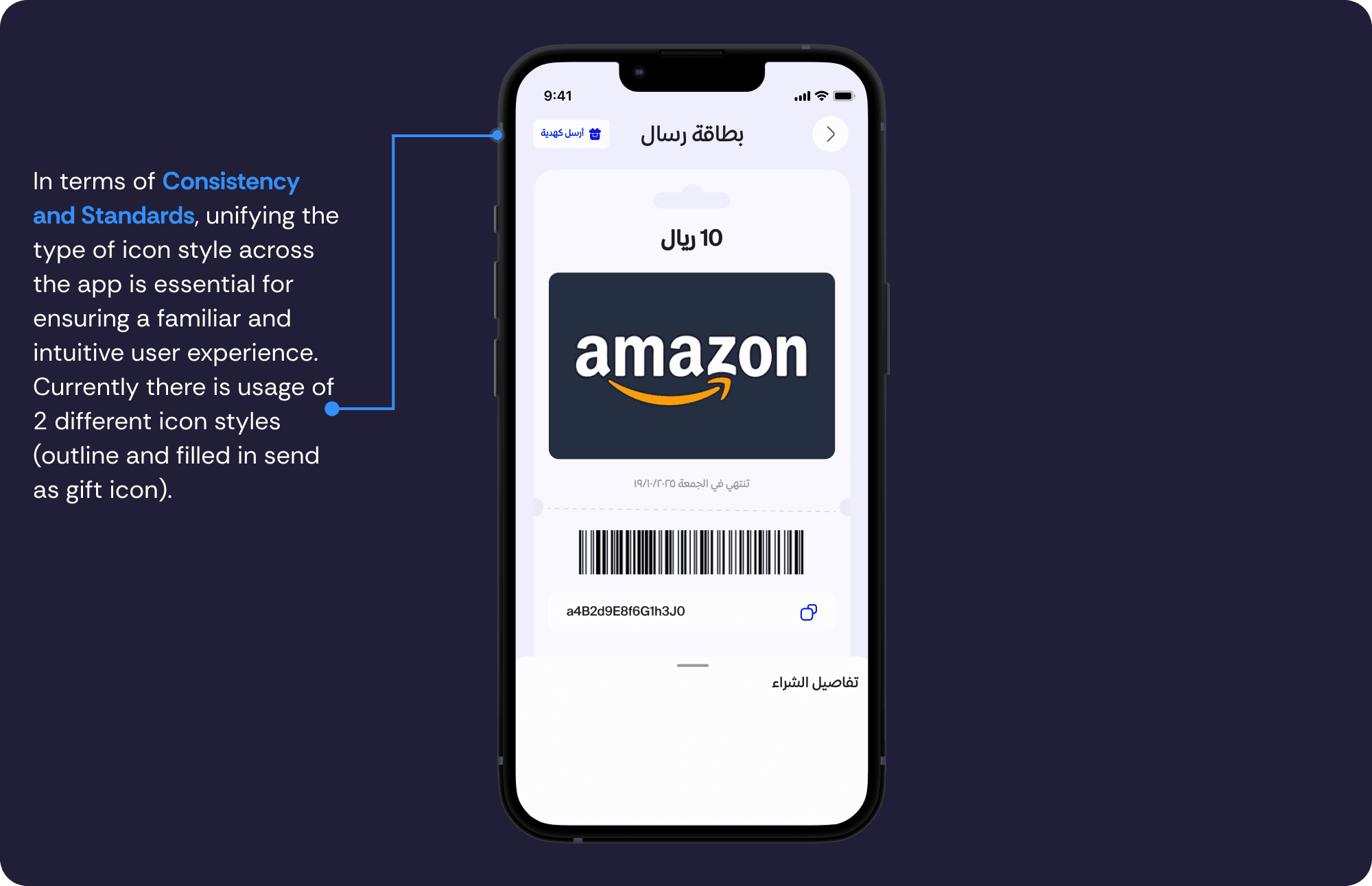
Unified Icons: Consistent visual language
Quick Actions: "Copy Code" and "Send Card" buttons directly on cards
Filters: Categorize cards by type
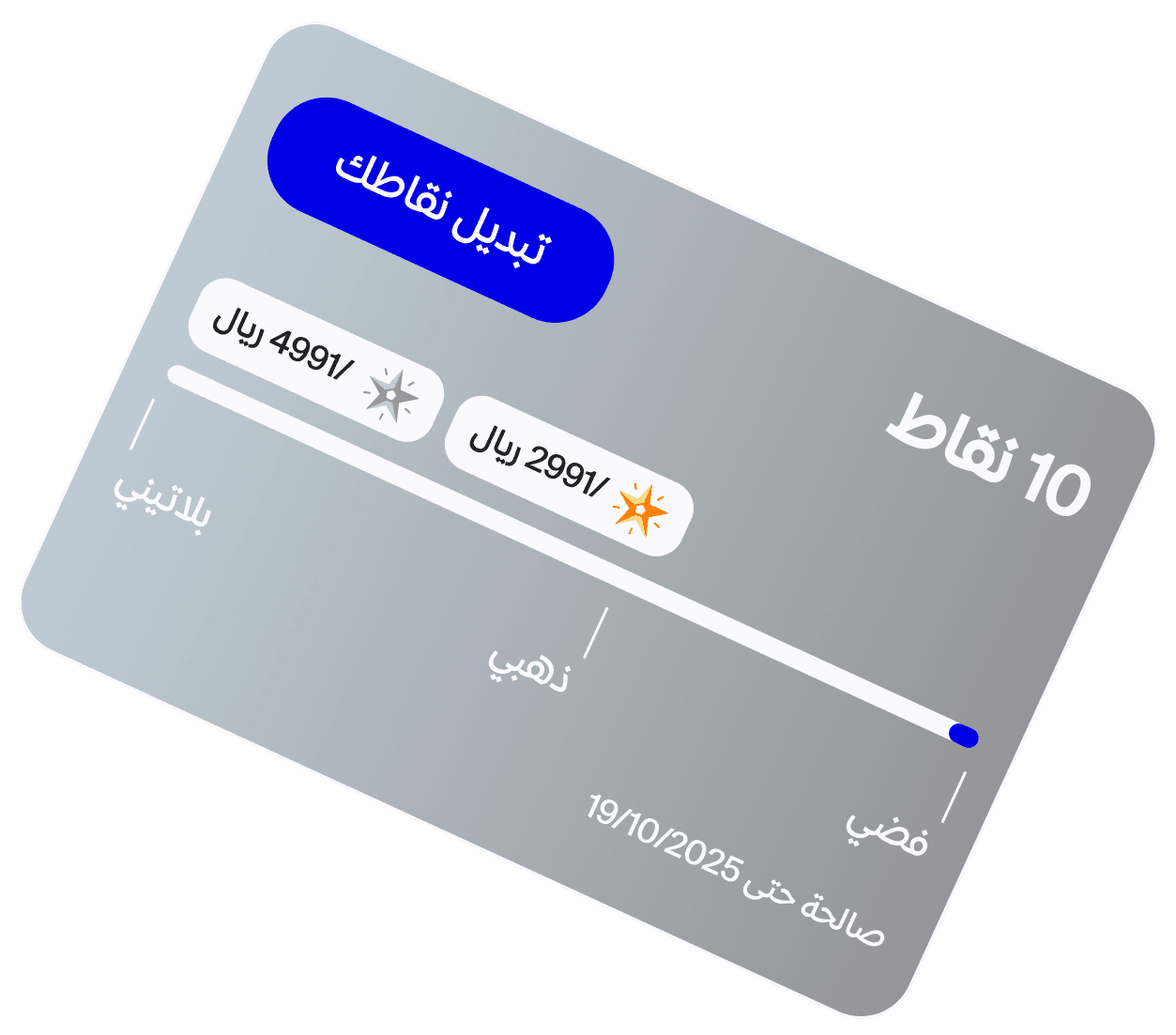
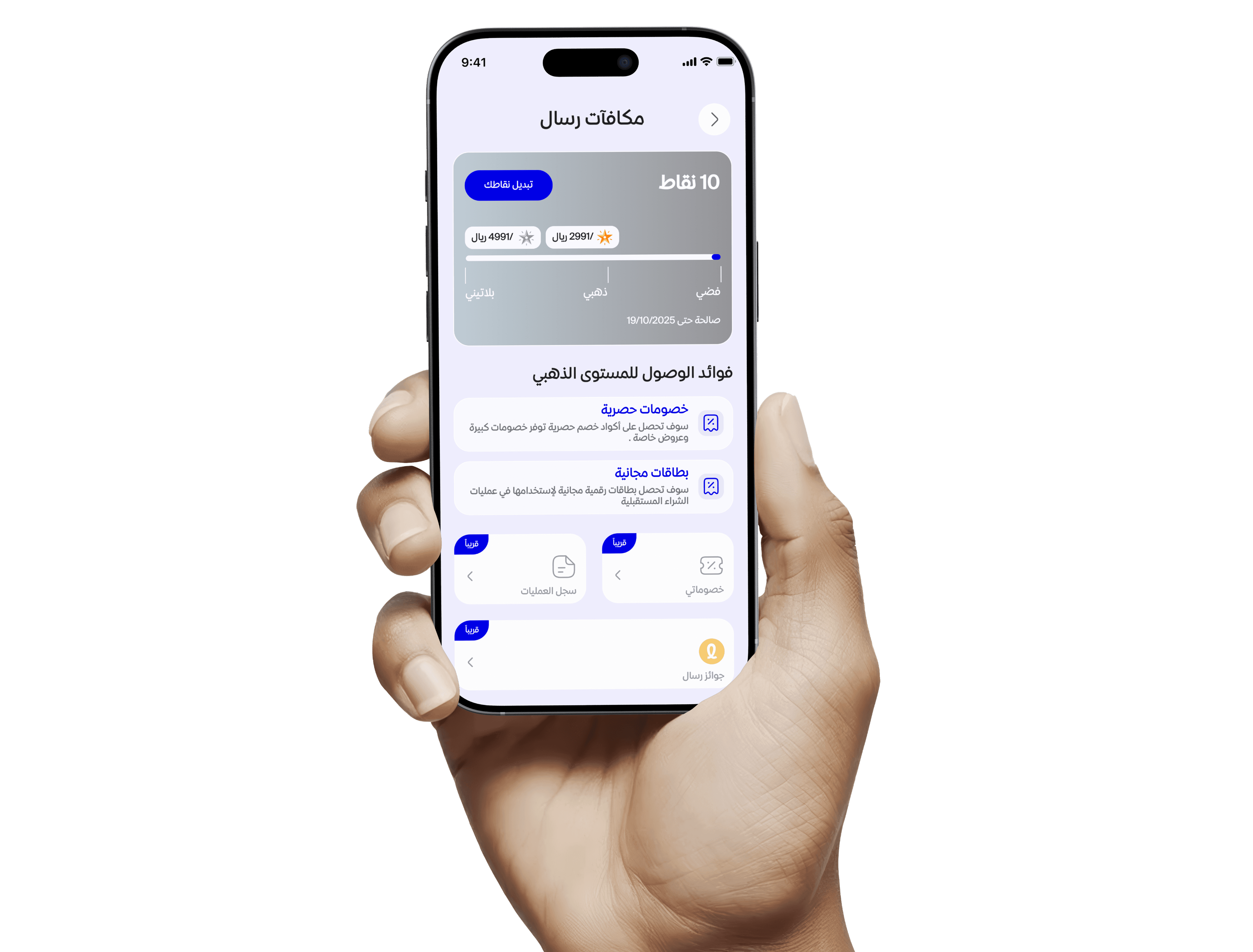
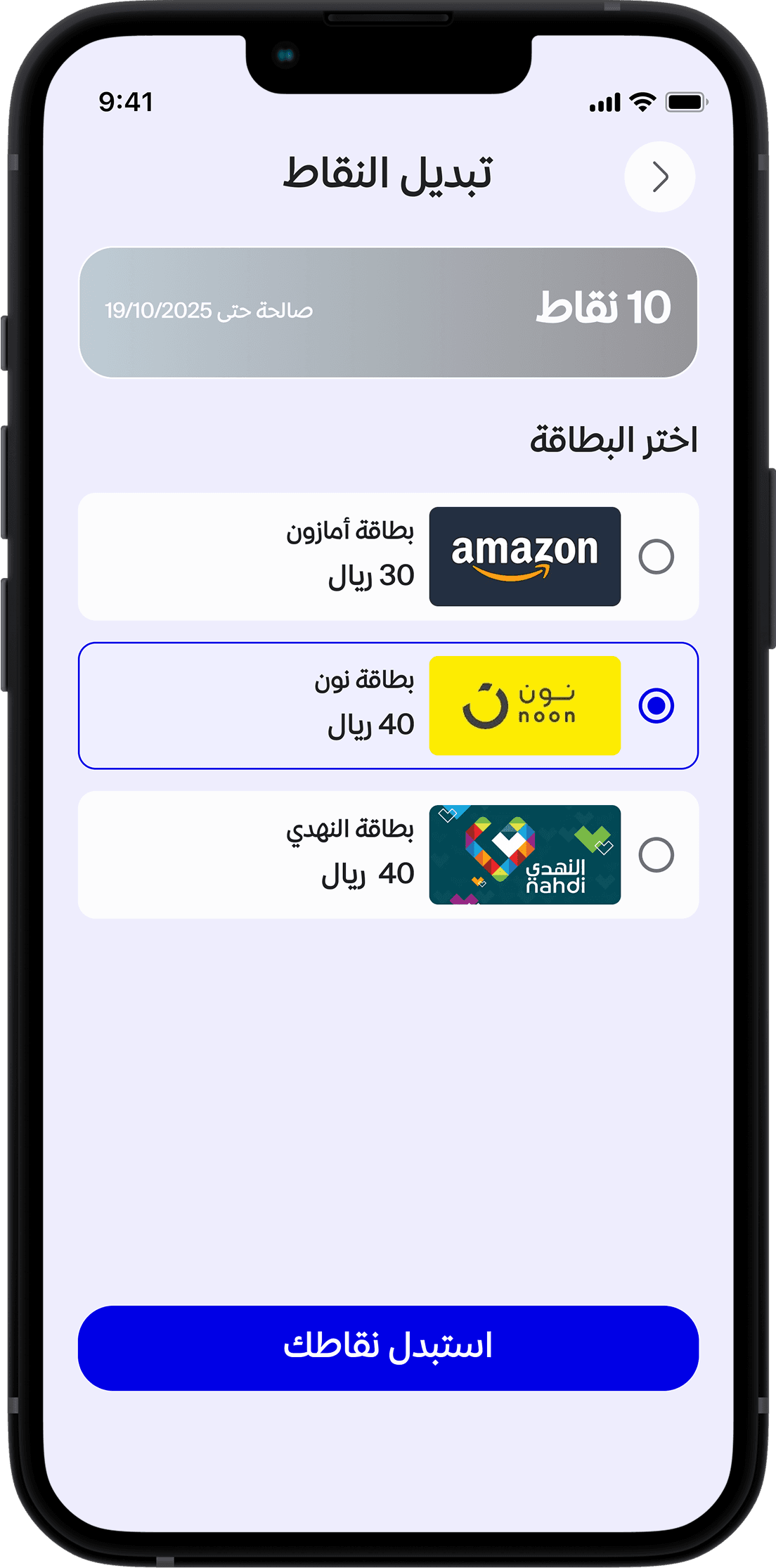
B. Loyalty Exchange Solutions
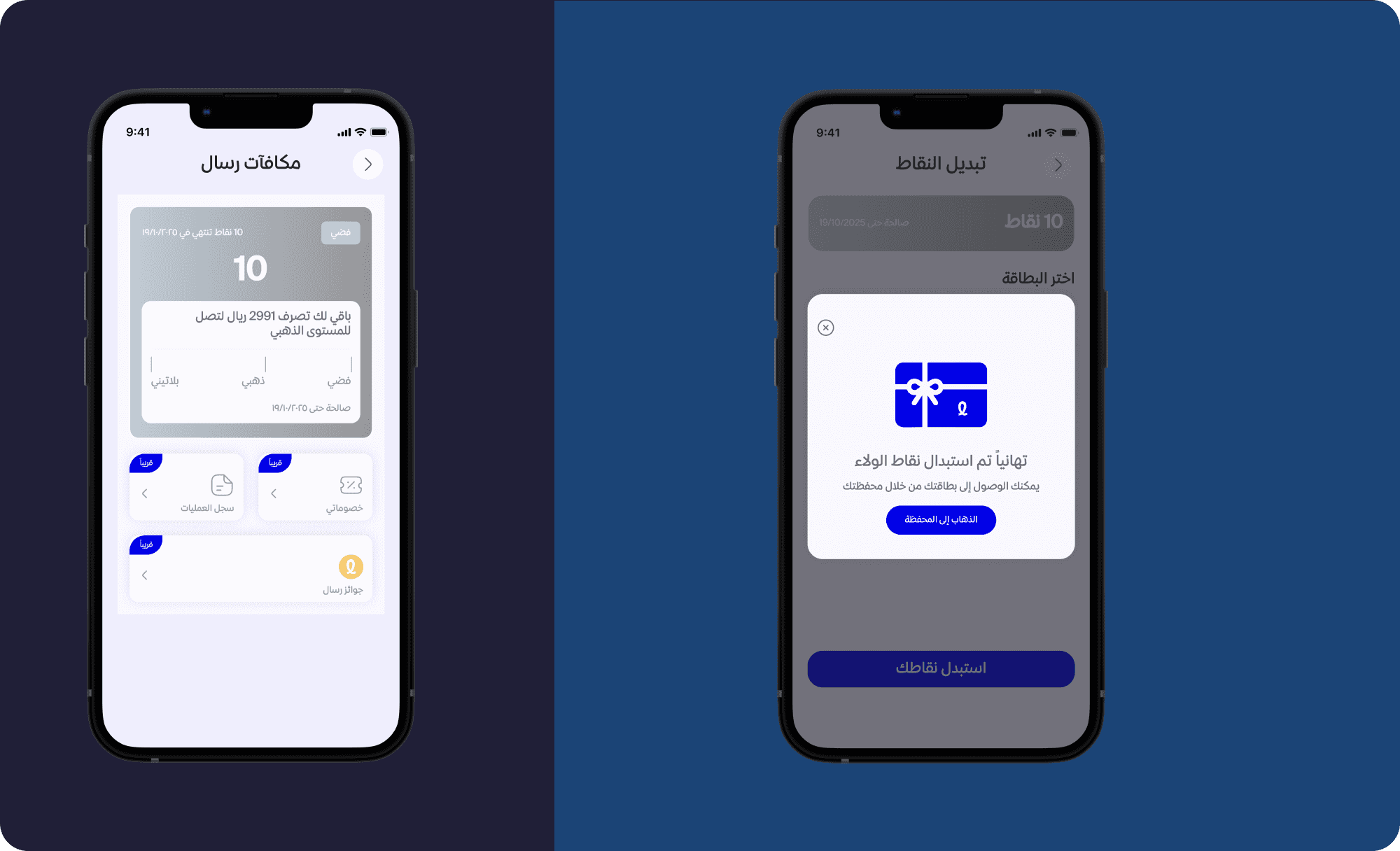
Dedicated Exchange Button: Clear call-to-action for point redemption
Improved Visual Hierarchy: Emphasize key info, remove repetition
Progress Indicators: Display unlocked rewards and next milestones
4. Prototype Stage
To improve usability, enhance clarity, and provide intuitive access to important actions such as filtering, copying card codes, and exchanging points, I created wireframes to visualize the structure and layout of the redesigned solutions, serving as a blueprint for the interface.
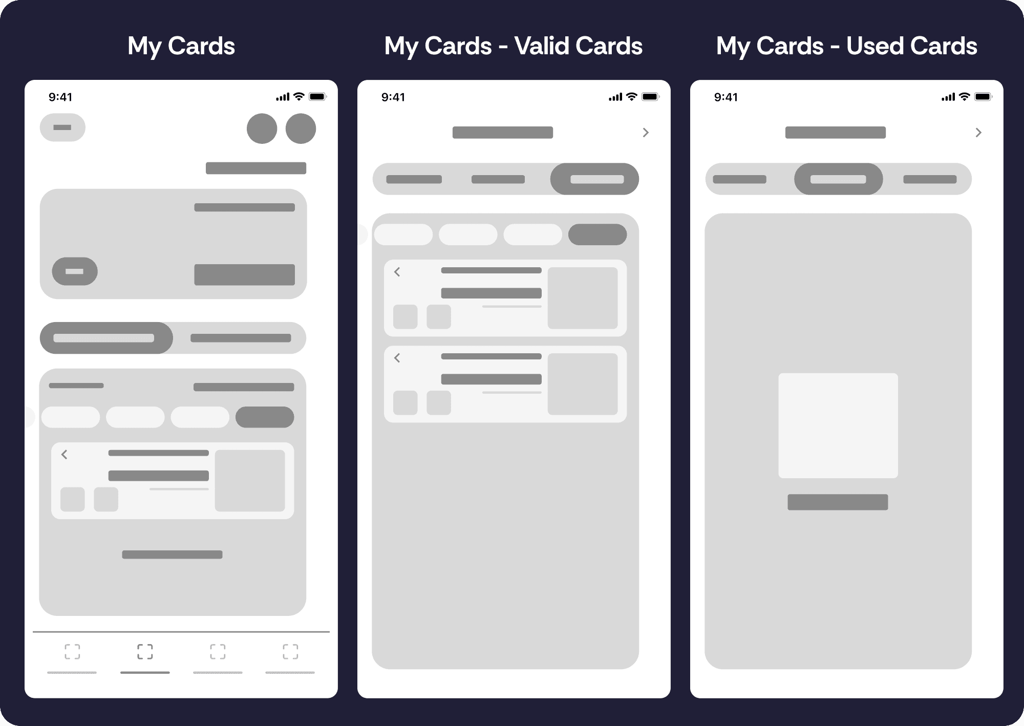
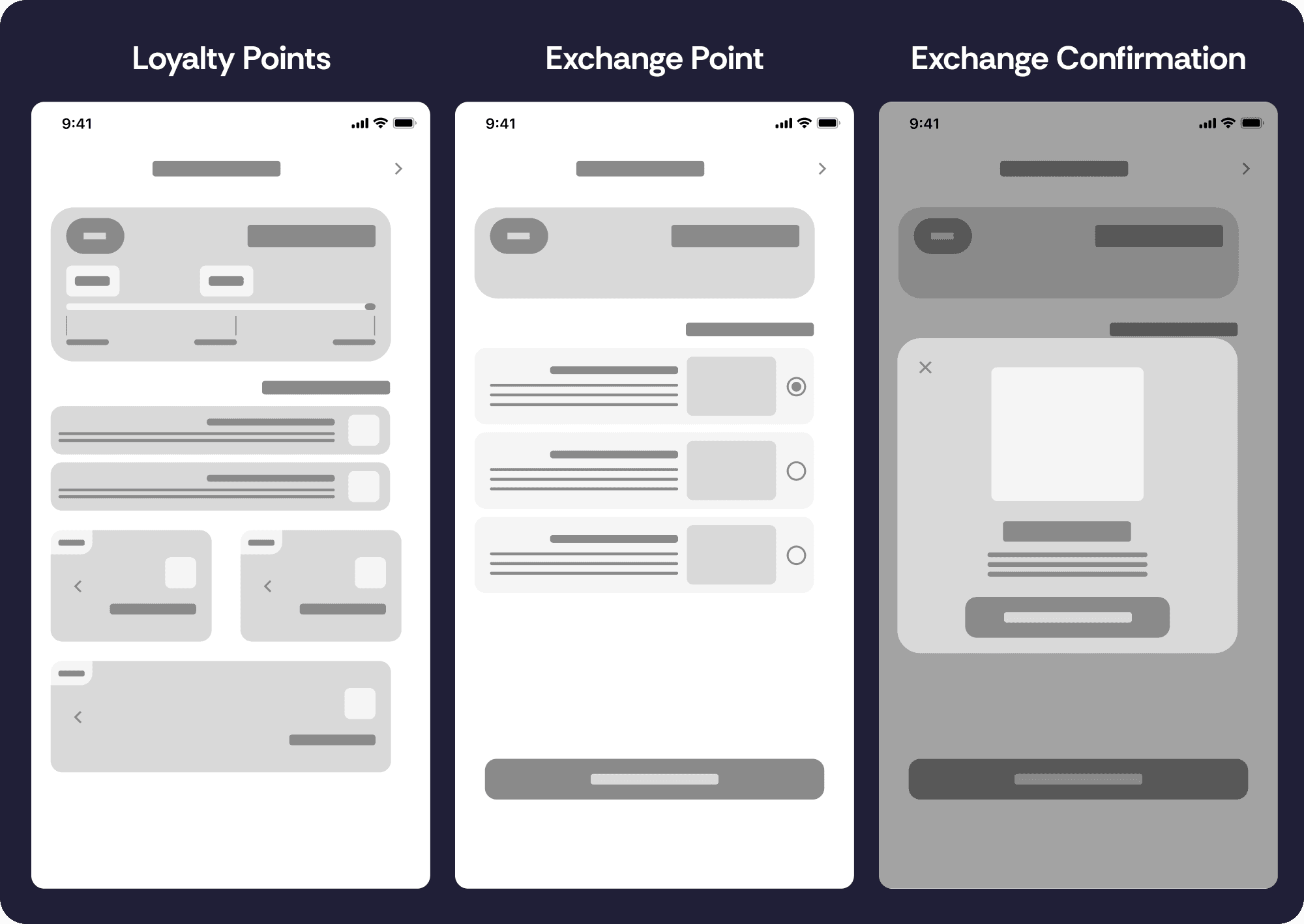
Redesigning Screens (Before & After)
This section outlie the screen redesigning with reasoning of the changes.
5. Testing Plan Stage
Since there is a time constraint and no possibility to recruit users for this assignment, this is just how I am planning to conduct a usability testing and A/B testing (old vs new design) to validate the new redesign.
1- User Testing Plan
Objectives:
Test if users can find and use the exchange feature
Test ease of managing cards and using quick actions
Participants: 5–7 current/potential users
Session Time: 20–30 mins
Tasks:
Exchange loyalty points
Filter cards, copy, and send a card
Metrics:
Quantitative: Task time, errors, success rate
Qualitative: Pain points, user feedback, satisfaction
Success Criteria:
Users complete key tasks with minimal assistance
Clear understanding and high satisfaction with new flows
2- A/B Testing Plan
Objective: Compare original vs redesigned UI for usability impact
Metrics:
Conversion Rate (points exchanged or cards sent)
Click-Through Rate (CTR) on CTA buttons
Bounce Rate
Time on Task
Task Success Rate
Error Rate
Conclusion
In this 2 days challenge, I:
Diagnosed key usability problems using heuristics
Created personas and user stories to humanize pain points
Prioritized changes based on severity and effort
Delivered wireframes focused on clarity, consistency, and usability
Proposed a scalable plan for user validation
This challenge reinforced the importance of combining UX principles with quick iteration—delivering thoughtful solutions, even under tight constraints. It also highlighted the value of collaboration and open communication. Regardless of the outcome, sharing feedback with job candidates is a mark of professionalism and respect for their time and effort—especially in UX, where empathy and communication are core values. Unfortunately, I didn’t receive any response from the design team after completing the challenge, which was a missed opportunity for mutual learning.