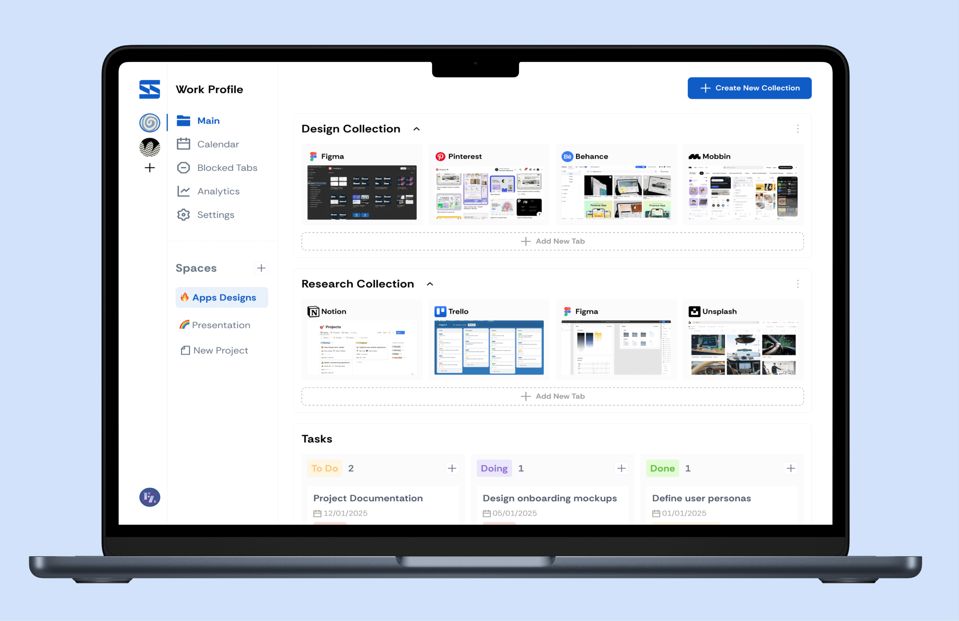
I had a few hundred bookmarks and a folder structure I'd built myself — and I still couldn't find things in it. Not because I hadn't organized. Because organizing once isn't enough:
The goal wasn't a better filing system. It was closing the gap between saving something and being able to find it again — without asking me to maintain more structure than I already wasn't maintaining.

The gap: Nothing combines zero added organizing effort, meaning-based search, real visual recall, and keeps your data on your own machine. Tools are either fully manual, or "smart" in exchange for sending your browsing history to a server.






This is the part of the process worth showing in full, because the direction actually changed twice — once on the information architecture, once on the interaction design.
V1 embedded every bookmark and grouped them with incremental nearest-centroid clustering — the "smart" part of the pitch. Run against my real, few-hundred-bookmark library, the clusters were technically coherent but felt arbitrary: sites I'd have filed together stayed apart, and the labels read as fragmented keyword soup rather than categories I'd trust. The AI's idea of "similar" didn't match my own mental model, and a tool that reorganizes your bookmarks in a way you don't trust is worse than one that does nothing. I dropped automatic clustering entirely and mirrored the real Chrome folder tree instead — moving the "smart" layer to where it could add value without asking me to trust a new structure: search.

Before committing to a UI, I sketched five distinct directions to compare structurally different ways to browse the same data:

Folder Explorer won for matching the new "mirror real folders" architecture, then converged toward a soft, translucent "liquid glass" aesthetic (frosted panels, a gradient canvas, pill-shaped nav). The folder icon itself went through several passes before landing on a version legible at both card and sidebar-row size:

This ended up being the most technically resilient feature in the tool, purely because the naive version failed on contact with real sites:
A plain
<iframe>— blocked immediately byX-Frame-Options/ CSP on most real "inspiration" sites (Dribbble, Behance, Awwwards — exactly the sites this tool is meant to help with).
Scoped response-header stripping via
declarativeNetRequest, restricted to sub-frame requests initiated by the extension's own dashboard — enables the preview without weakening framing protection anywhere else in normal browsing.
Broadened iframe sandbox permissions — the first pass was so restrictive that modern JS-heavy sites threw during initialization and rendered nothing, even once the headers were fixed.
Spoofed
Sec-Fetch-*request headers — some sites don't block via a header at all; they detect framing server-side and quietly serve different content instead.
A graceful floor: for the sites that still can't be framed, the fallback card leads with the site's own Open Graph social-preview image instead of a bare favicon — so even a "blocked" result still looks like the real site.
The tool solves the problem it set out to solve: bookmarks stay organized the way I already think about them, and a meaning-based search catches what a keyword search never could. But the most transferable lesson came from the pivot, not the ship: an "AI-powered" feature isn't automatically better UX. The first version replaced the user's own structure with the model's guess at one, and it was worse — not because the clustering was technically bad, but because trust in your own organization is the actual product being protected. The fix wasn't a better model. It was moving intelligence to where the user has no existing mental model to compete with: search.
A real screenshot-capture fallback for the small remaining set of sites no header trick can unblock, and a nested-folder view in the dashboard for structures deeper than one level (currently flattened for simplicity).